Updated for Divi 5: In Divi 5 you can build these tabs without any code, using a Grid layout and Interactions. I tested both methods in Divi 5.18. If you prefer the original jQuery method, the CSS and jQuery in this post are already updated for Divi 5. Used this tutorial on a Divi 4 site before? Replace your CSS with the new version: the CSS from the earlier version of this post stacks the Blurbs on top of each other in Divi 5.
How to add icons and different modules to Divi Tabs
Divi's Tabs module only shows text in the tab titles, so to get tabs with icons you build your own: Blurb modules work as the tab titles, and regular Divi sections hold the content of each tab. In Divi 5 the Tabs module can also hold other modules inside each tab, so if you don't need icons, the native module may be all you need.
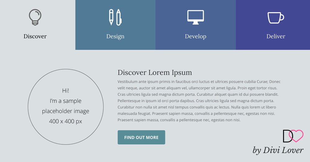
Instead of adding icons to the Divi Tabs Module or looking for a way to display another module inside each tab, I took a different approach and created a custom tabs layout using Blurbs as tab titles and regular Divi sections for each tab's content. This way we aren't constrained by the default Tabs Module settings and can put any modules inside each tab. How great is that? My layout scales nicely for mobile and is available for you to download. Below I'm giving step-by-step instructions on how it was made.
The video was recorded in Divi 4. The structure is the same in Divi 5, but use the updated CSS and jQuery from this post, or the new no-code way with Divi 5 Interactions.
Free download
Blurbs as Tabs Layout
A Divi layout with custom tabs: four Blurbs with icons as the tab titles and a section for each tab, switched with a few lines of jQuery. Works in Divi 5 and Divi 4.
Get the free downloadDo you still need custom tabs in Divi 5?
Only if you want icons (or any custom design) in the tab titles. In Divi 5 the Tabs module supports nested modules, so each tab can hold images, buttons, Blurbs or other modules, not just text. The tab titles are still plain text, though, so for icon tabs like in my demo, the Blurbs approach is still the way to go.
How to set up the Blurb tab titles
You need one section with the CSS ID blurb-tabs, a row with one column, and one Blurb module per tab, each with the CSS class tab-title.
Step 1: Create the titles structure
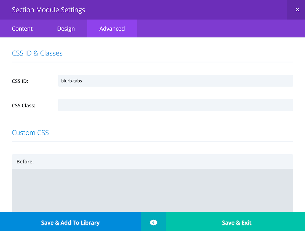
Add a standard section and set this section padding to 0. Set the CSS ID of the section to blurb-tabs: in Divi 5, go to Advanced tab ➜ Attributes ➜ Add Attribute ➜ CSS ID (Divi 4: Advanced tab ➜ CSS ID & Classes).
Inside this section, there should be a row with one column. We don't need to worry about the number of columns for the tabs, we will control the layout with the column's Grid settings (Divi 5) or with CSS flexbox. The demo uses four tabs, but with some tweaks, it can easily be adapted to have either more or fewer.
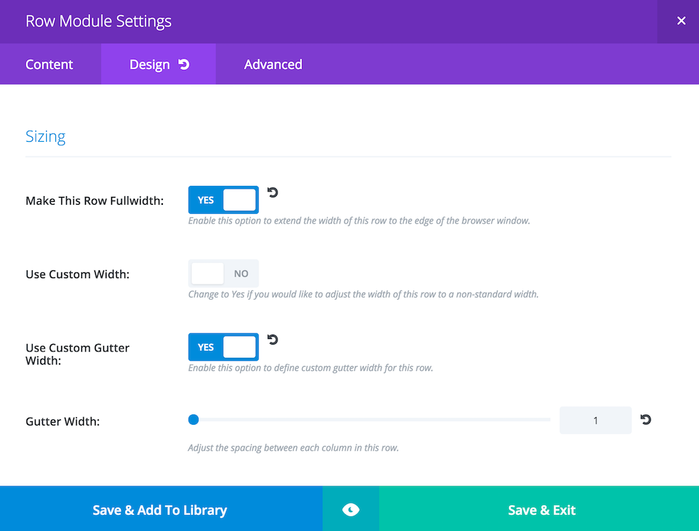
For the row settings, make the row fullwidth and set the Gutter Width to 1.
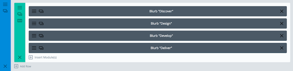
Now we add four Blurb Modules. You can style the blurbs as you wish. In my layout, I'm using icons, I've set different padding for desktop, tablet and mobile, and gave each blurb a different background colour. The important thing is to add a custom class of tab-title to each Blurb: Advanced tab ➜ Attributes ➜ Add Attribute ➜ CSS Class (Divi 4: Advanced tab ➜ CSS ID & Classes).
For the jQuery method, also set each Blurb's link URL to #tab1 (#tab2, #tab3, #tab4: each blurb links to a different ID). For the Divi 5 Interactions method, leave the link URL empty, because a link would make the page jump down to the section.
Step 2: Style the titles
Obviously, right now we have four fullwidth blurbs. In Divi 5 you can fix this without code, in the column settings:
- Open the Column settings and go to Design tab ➜ Layout
- Set Layout Style to Grid
- Set Number of Columns to 4, then switch to the tablet view and set 2, and to the phone view and set 1
- Set the Horizontal Gap and Vertical Gap to 0
Divi 5's grid gives every Blurb the same width on each screen size, so you don't need the width CSS and media queries below.
In Divi 4 (or if you prefer CSS), it can be easily fixed with CSS flexbox. If you'd like to learn more about it, there is a fun game called Flexbox Froggy, which teaches you all the flexbox properties. Add the CSS in Divi ➜ Theme Options ➜ General ➜ Custom CSS or in your child theme's stylesheet. Here is our CSS to fix it, updated for Divi 5 (Divi 5 columns stack modules vertically and add a gap between them, so the column needs flex-direction: row and gap: 0):
/* Style the Blurbs Tabs */
#blurb-tabs .et_pb_column {
	display:flex;
	flex-direction:row; /* Divi 5: columns stack modules vertically by default */
	align-items:center;
	justify-content:center;
	flex-wrap:wrap;
	gap:0; /* Divi 5: removes the default space between modules */
}
#blurb-tabs .tab-title {
	width:25%;
}
We need to use media queries to change the width of blurbs on smaller screen sizes, like this:
@media (max-width: 767px ) {
	#blurb-tabs .tab-title {
		width:50%;
	}
}
@media (max-width: 479px ) {
	#blurb-tabs .tab-title {
		width:100%;
	}
}
To use a different number of columns for tabs, you'd need to adjust those width values.
In my demo layout, I'm also adding a few adjustments for the tablet and mobile view (like changing the icon size and moving the icon to the left of the title on mobile). Here are the full media queries styles for this layout:
/* Tab Titles Mobile Styles */
@media (max-width: 767px ) {
	#blurb-tabs .tab-title {
		width:50%;
	}
	#blurb-tabs .tab-title .et_pb_main_blurb_image {
		margin-bottom:10px; /* Reduce icon bottom margin */
	}
}

@media (max-width: 479px ) {
	#blurb-tabs .tab-title {
		width:100%;
	}
	#blurb-tabs .tab-title .et_pb_blurb_content { /* This moves icon to the left */
		display:flex;
		flex-direction:row;
		align-items:center;
		justify-content:flex-start;
	}
	#blurb-tabs .tab-title .et_pb_main_blurb_image { /* Fix icon margins on mobile */
		margin-bottom:0;
		margin-right:30px;
	}
}
This gives us a nice, responsive look for the blurbs, but we also use some custom CSS to create hover effects for each tab/blurb, as well as set different colours for the "active" tab. You need this CSS for both methods, the Divi 5 Interactions and the jQuery:
/* Hover Styles for Blurb Tabs - Titles */
#blurb-tabs .tab-title {
	transition:all .3s ease-in-out;
}
#blurb-tabs .tab-title:hover {
	cursor:pointer;
	background:#222; /* Tab hover background color */
}
#blurb-tabs .tab-title.active-tab {
	background:#D9DFE2; /* Active tab background color */
}
#blurb-tabs .tab-title.active-tab .et_pb_blurb_container h4 a {
	color:#000; /* Active tab title color */
}
#blurb-tabs .tab-title.active-tab .et-pb-icon {
	color:#666!important; /* Active tab icon color */
}
How to add the tab content sections
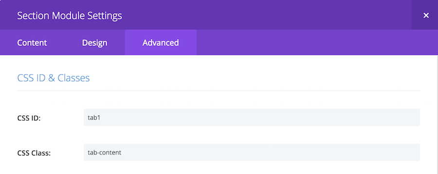
Each tab is a regular Divi section placed below the Blurbs, with the CSS class tab-content and its own CSS ID: tab1, tab2, tab3 and tab4.
Step 3: Add your content
We need four sections, one for each tab. The best part of this layout is that you can put literally anything you like in each tab, as long as it fits inside a single section. I'm using an Image, Text and a Button Module in each section/tab.
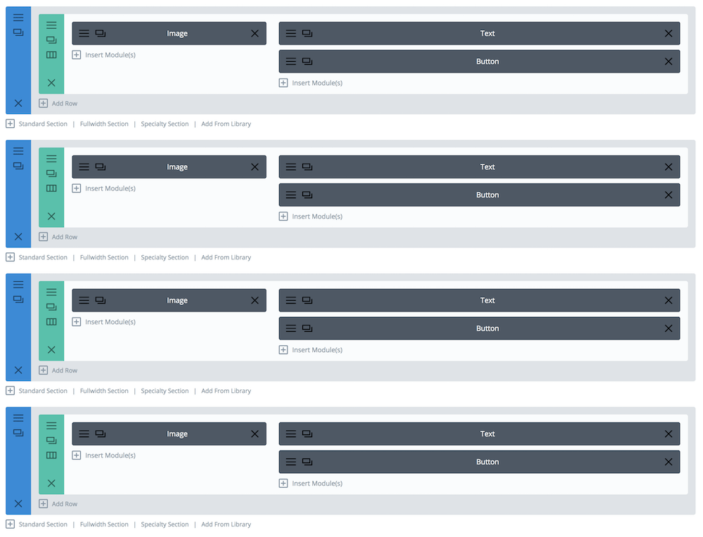
The important part is to set proper CSS classes and IDs. Each section needs a tab-content class and a unique ID of tab1, tab2, tab3 and tab4. For the jQuery method, the IDs must be the same as the Blurbs' URLs, without the # symbol.
How to switch the tabs with Divi 5 Interactions (no code)
In Divi 5, sections 2 to 4 are hidden on page load with the Visibility settings, and each Blurb gets Click interactions that show its own section and hide the others. No jQuery and no CSS for hiding the sections.
Step 4: Hide the other tabs on page load
Open the settings of the 2nd, 3rd and 4th section, go to Advanced tab ➜ Visibility ➜ Disable on and select Desktop, Tablet and Phone. Leave the first section visible: this is the tab that's open when the page loads. The hidden sections are still in the page, so an interaction can show them.
Step 5: Add the Click interactions
Open the first Blurb, go to Advanced tab ➜ Interactions ➜ Add Interaction and choose Click as the Trigger Event. Then:
- Set the Effect Action to Show Element and pick the first section (tab1) as the Target Element
- Add one more Click interaction for each of the other sections (tab2, tab3, tab4), with the Effect Action Hide Element
Repeat this for every Blurb: each one shows its own section and hides the other three. With four tabs, that is four interactions per Blurb.
Step 6: Highlight the active tab and scroll to it (optional)
To give the clicked Blurb the active-tab class (used by the hover and active CSS from Step 2), add these Click interactions to each Blurb:
- Add Attribute, with the Blurb itself as the Target Element, Attribute Name
classand Attribute Valueactive-tab - Remove Attribute, with the same name and value, for each of the other Blurbs
Also add the active-tab class to the first Blurb in its settings (next to tab-title, separated with a space), so it's highlighted on page load.
If you'd like the page to scroll to the open tab (useful on mobile, where the content sits below four stacked Blurbs), add one more Click interaction with the Effect Action Scroll To Element and the Blurb's own section as the Target Element. If you have a fixed header, add .tab-content { scroll-margin-top: 80px; } to your CSS (replace 80 with your header height).
That's a lot of clicking with many tabs: with four tabs and the active state, each Blurb gets eight interactions. If you build tabs like this often, the jQuery method below is quicker to set up.
How to switch the tabs with jQuery (Divi 4 and Divi 5)
Hide the content sections with a short CSS rule, then a few lines of jQuery add the active-tab class to the clicked Blurb and show the section with the same ID as the Blurb's link. This works in Divi 4 and Divi 5.
Step 4: Hide the tabs on page load
We'll hide the sections with CSS, like this:
/* Hide the tabs content/sections, except the open one */
.tab-content:not(.tab-open) {
	display:none;
}
This version is updated for Divi 5. The original code hid and showed the sections with jQuery's hide() and show(), which switches the open section to display: block. Divi 5 sections are flexbox containers, so they would lose the space between their rows. Now the jQuery only moves a tab-open class, and the CSS hides every tab-content section without it.
Step 5: A little jQuery magic
Now, with some jQuery, we'll add an active-tab class to each Blurb title when clicked, and show the section with the same ID as the Blurb's href attribute (URL), while making sure that the other sections are hidden. This is the working code:
jQuery(document).ready(function($) {
	/* Blurbs as Tabs */
	$('.tab-title').each(function () {
		var section_id = $(this).find("a").attr("href");
		$(this).find("a").removeAttr("href");
		$(this).click(function() {
			$(this).siblings().removeClass("active-tab");
			$(this).addClass("active-tab");
			$('.tab-content').removeClass("tab-open");
			$(section_id).addClass("tab-open");
		});
	});
});
If you are not sure where to put that jQuery code, I have written some detailed instructions on how to add JavaScript to your Divi page. In short: wrap it in <script> tags and add it in Divi ➜ Theme Options ➜ Integration or in a Code module on the page. That's it, you should be able to easily recreate this layout on your Divi website 🙂
How to make one tab open on page load?
To make one of the sections visible by default, add another class to this section: tab-open (so it will have both: tab-content tab-open, without the comma, just a space between the two). And to make the corresponding tab active, the Blurb Module also needs a second class, active-tab (it will have both: tab-title active-tab).
With the updated CSS from Step 4 you don't need any extra CSS for this: .tab-content:not(.tab-open) already keeps the open section visible.
How to add a smooth scroll to the chosen section on tab click?
If you'd like your page to automatically scroll to the selected section (which can be useful on mobile devices), you'd need to add this line to the jQuery function:
$('html, body').animate({scrollTop: $(section_id).offset().top}, 1000);right after
$(section_id).addClass("tab-open");so the full JS code would look like this:
jQuery(document).ready(function($) {
	/* Blurbs as Tabs */
	$('.tab-title').each(function () {
		var section_id = $(this).find("a").attr("href");
		$(this).find("a").removeAttr("href");
		$(this).click(function() {
			$(this).siblings().removeClass("active-tab");
			$(this).addClass("active-tab");
			$('.tab-content').removeClass("tab-open");
			$(section_id).addClass("tab-open");
			$('html, body').animate({scrollTop: $(section_id).offset().top}, 1000);
		});
	});
});
And if you are using a fixed navigation, you'd need to edit this new line of code (and replace 80 with your navigation height):
$('html, body').animate({scrollTop: $(section_id).offset().top - 80}, 1000);That's it! If you build something fun with these tabs, share it in my Divi Lovers Facebook group.