
Changing the number of posts in a row in the Divi Blog Module Grid
Divi Theme Blog Module comes with two different layout options: the Fullwidth layout and the Grid. Unfortunately, we do not have a lot of control over the look of the grid elements. The number of posts in a row is controlled automatically, depends on the current screen size, and is limited to three columns at most.
In this tutorial, I'd like to show you how to use the powerful CSS Grid to customize the grid layout to any number of columns and even break the grid by changing the size of some of the posts.
Free Blog Layouts for the Theme Builder!
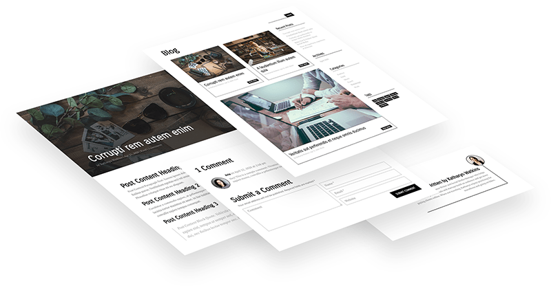
I’ve also created a little freebie for you. Divi Lover subscribers can download and use these free Divi Blog Theme Builder templates, which include a template for the archives/categories and a single post template! Check out the demo pages and let me know what you think in the comments!
How to use CSS Grid with Divi Blog module
To use the CSS Grid we need to make sure our Blog module has a correct HTML structure. Navigate to the Module Design settings and change the layout to Fullwidth.

This will make sure that each post, the article tag, is displayed inside the same parent container, which we can target with CSS.
Next, add a custom CSS class to your Blog module Advanced tab (I forgot about this myself when I recorded this walkthrough, but it is an important step). I am going to use the dl-blog-module1 CSS class:
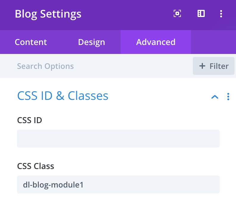
Custom CSS
First, we need to target the parent container, the div with the et_pb_ajax_pagination CSS class:
.dl-blog-module1 .et_pb_ajax_pagination_container {
    display: grid;
    grid-gap: 20px;
    grid-template-columns: repeat(4, 1fr);
}
This will create a grid with 4 columns.
.dl-blog-module1 .et_pb_ajax_pagination_container>div {
    grid-column: span 4;
}
We could also use this:
.dl-blog-module1 .et_pb_ajax_pagination_container>div {
    grid-column-start: 1;
    grid-column-end: 5;
}
Or the shorter version:
.dl-blog-module1 .et_pb_ajax_pagination_container>div {
    grid-column: 1/ 5;
}
Changing the grid for mobile
Here are some CSS media queries, which you could use to change the number of posts in a row on smaller screen sizes:
@media (max-width:980px) {
	.dl-blog-module1 .et_pb_ajax_pagination_container {
		grid-template-columns: repeat(3, 1fr);
	}
	.dl-blog-module1 .et_pb_ajax_pagination_container>div {
		grid-column: span 3;
	}
}


@media (max-width:600px) {
	.dl-blog-module1 .et_pb_ajax_pagination_container {
		grid-template-columns: repeat(2, 1fr);
	}
	.dl-blog-module1 .et_pb_ajax_pagination_container>div {
		grid-column: span 2;
	}
}

@media (max-width:460px) {
	.dl-blog-module1 .et_pb_ajax_pagination_container {
		grid-template-columns: repeat(1, 1fr);
	}
	.dl-blog-module1 .et_pb_ajax_pagination_container>div {
		grid-column: span 1;
	}
}
Targeting the nth-posts
You can "stretch" any post using the span function and grid-column property. You can use the post ID to target one specific post or the nth-child selector to target the fifth one, or every third, etc. You'll find a handy guide with some nth-child examples on CSS-tricks website.
This is how your CSS could look:
.dl-blog-module1 .et_pb_ajax_pagination_container .et_pb_post:nth-child(5) {
    grid-column: span 2;
}
Free Theme Builder Blog Layout Pack!
I've played with custom CSS and the grid a bit and created this Category/Archive page layout along with the Single Post layout. Feel free to download the JSON files if you're a Divi Lover subscriber! I hope it's useful!

Free Resources for Divi Lovers
Access this layout and dozens of other freebies - available exclusively for newsletter subscribers.
New here?
Join the newsletter to unlock the Freebie Library and get weekly Divi tips, tutorials, and design goodies.
Already subscribed?
Go straight to the Freebie Library and download this layout - plus lots more!


How can I add a button (CTA) to my blog post, when I use the classic blog post and with a Theme Builder on all blog posts?
Like the button you have in this post?
Hi Ania…
WordPress and Divi default to 10 Posts on a Post Archive page.
This is great when you have a single column or the number of columns is even (2) or a multiple of 10 (5).
A problem arises when you have 3 or 4 columns because you get blank areas at the end of your grid unless you span posts across multiple columns, which may not be required by a client.
Is there a CSS “fix” that permits the developer to specify the number of posts on the archive page that can be included in the @media query and will thus work on the fly?
Best wishes,
Martyn
Hi Ania,
This blog grid tuneup is excellent! A question: I can view the changes (to a two col grid) when I go to my live page, but the Divi Builder still shows me the “fullwidth” view. I guess that’s normal? If not, I would love to be able to view the two col layout in the builder so I can see the design changes I am making without having to save and go to my live page. Any way to do so?
I’m glad it’s helpful 😉
The Selectors inside the Visual Builder would need to be a bit different. There is no “et_pb_ajax_pagination_container” class, so to target the grid container you would need to use:
“.dl-blog-module1 > div”.
Hello Ania,
Great tutorial and very helpful, can you give me advise on how to target the post card?
I tried to target the “article” within “.et_pb_ajax_pagination_container” but it did not work.
I need to add a drop shadow to each post card but do not know what to target….
Thanks in advance 🙂
Daniel
Importing the layout for the blog page by default it is assigned to all archive pages. I don’t understand why that assignment. Can you explain that please?
You can cheange the assigment if you like, but All Archive pages are the categories pages, date archives, author and tag archives. Blog page is only the main index page, and it is good to have the same layout across all archives 🙂
Hi, Ania, your post is very helpful… thank you! but there is a mistake in the code for the grid for mobile versions…
When you wrote:
.dl-blog-module1 .et_pb_ajax_pagination_container {
grid-template-columns: repeat(3, 1fr);
}
Should be:
.et_pb_ajax_pagination_container {
grid-template-columns: repeat(3, 1fr);
}
So you wrote an extra “.dl-blog-module1 ” in the three sizes
Anyway, it is a very good tutorial
I really appreciate!!
It was intentional 😉 the class is there to target a specific Blog module, not all Blog modules across the entire website.
Ania, you’re the best!
Your tutorials are awesome.
Thank you,
This did not change the blog module on mobile for me.
This tutorial was such a lifesaver, thank you for your hard work!
My thumbnails are all getting cropped in the blog grid layout. Is there a way to change the thumbnail size/aspect ratio?
Maybe you’ll find these instructions helpful.
Wew! This is very helpful, Ania 🙂
Hi
Thanks for the great tutorial!
This is a very good and quick method for styling a blog.
Is there any way to display the correct grid layout in internet explorer?
I tried with Autoprefixer CSS online but it still looks bad
IE supports the grid partially with the -ms- prefix (but I am not sure what partial support mean exactly, I no longer check my websites in IE, since it is not supported by Microsoft).
Hi, Thank you for that fantastic piece of code! It works perfect on my blog module. I also tried to make it work for a 2 image row (section, two-column row, image module in every column) by adding a class name to the row and to every column but it doesn’t show the columns in one row on mobiles. Could you give me a hint how to make this work? I also tried several other approaches but they don’t work because the section is within the content part of a specialty section of a template. Thank you!
Ania! Thank You!
I spent hours trying to do this by styling the ‘use grid’ layout following every tutorial I could find (including some JQuery options to get all the panels the same height) with marginal success.
I have followed your guide to create a 4/2/1 column responsive layout, and it works great – with equal grid heights included!!!
Only things I do notice are:
1. The “grid-template-columns: repeat(2, 1fr);” has a warning x in the Divi custom CSS panel. The “1fr” part it doesn’t like – but I left it in anyway.
2. The grid layout is only visible on a live preview of the page. In the Visual Builder it shows the posts full width.
Thanks again!
Thanks for the great tutorial!
Is it possible to use CSS Grid on Shop module with WooCommerce products to control the number of columns on different screen sizes?
I’m still using the old fashion width: nn%; and float:left;
Yes, the same method will work with product archives or Shop module.
How to add border with shadow for every post
Hi Ania,
Thanks for the great tutorial it really helped me much. I am new to divi and I was looking for this style of modification.
About your last piece of code “Targeting the nth Posts”, in my blog posts there are 2 types of featured image sizes.
I want the 512 pixels wide images to span 1 column and the posts with wide images greater than 512 pixels to span 2 columns.
These settings I want to be done automatically each time I add a new post.
And 1 more request how to fix the row height for all posts since the post that spans 2 columns becomes a different height in same row than other posts spanning 1 column?
There is no way to target posts based on the featured image size you upload for them. And the Blog Module will use the same thumbnail size for each post anyway. The row height is adjusted automatically (the post spanning 1 column will match the bigger 2-columns post), you can see how that works on the demo page of the layout I cretaed.
Hi Ania,
awesome work, please more of that!
Especially about blog and detail sections / pages and grid.
I do have one more question for the template for the archive pages. Is it correct, that they wont be styled in the grid as the blog template ?
I just can have / see them like the full width list of posts one after the next.
Or did i miss something?
Best regards
Christian
You can create a template in the Theme Builder for your blog archives and use the blog module there. This CSS won’t target the default archives. I have a separate tutorial on styling categories and archives here.
Hi Ania,
thank you so much for thefast reply.
I could fix the problem in my specific case through your good information. In this case the customer had a different Theme and wanted to implement now DIVI Pagebuilder in that third party theme, that managed not well organizing the blog code structure in basic blog layout.
So i had to tweak the css a little like i saw it in your video – pointing further down the following elements with >…>…> and it worked now fine.
Thank you so much, i am already waiting for the next videos to come.
Best regards.
Christian
Thank you for yet another great tutorial. Do you have plans on creating an advanced course for Divi? I find your teaching style and methods very effective. I would especially like to learn more about CSS Grid and Divi and maybe some flexbox… ;)Thanks
Can this be used on the blog module too? I tried setting it in theme builder but it doesn’t pick up any styling.
Take a look at the video, I’m using it on the Blog module inside the Theme Builder 😉
Thanks for the prompt reply, I imported your template and it works on my archive pages but not my main blog page, I get the 4 columns but it seems the CSS isn’t being picked up..
https://ojayhealth.com/articles/
Sorry, didn’t follow your instruction fully, fixed it by copying over the CSS to child theme.
THanks
Always valuable information, keep up the good work.