Divi 3.4 Slim Optin Module
In version 3.4 Divi introduced a new html markup for its Optin Module. With the new structure the previously custom-styled forms may not look as you'd like. In this quick tutorial I'd like to show you what CSS you can use to change the default Optin Form into thinner and cooler version.
Free Resources for Divi Lovers
Access this layout and dozens of other freebies - available exclusively for newsletter subscribers.
New here?
Join the newsletter to unlock the Freebie Library and get weekly Divi tips, tutorials, and design goodies.
Already subscribed?
Go straight to the Freebie Library and download this layout - plus lots more!
I’m not a lawyer so this is not a legal advice, BUT you don't need any checkboxes to make your signup form GDPR compliant. You need the subscriber’s explicit consent to send them emails, but a checkbox is not the only way to get this consent. Use your header and a phrase like "Subscribe to" to make sure it’s clear that the user is consenting to a newsletter by signing up.
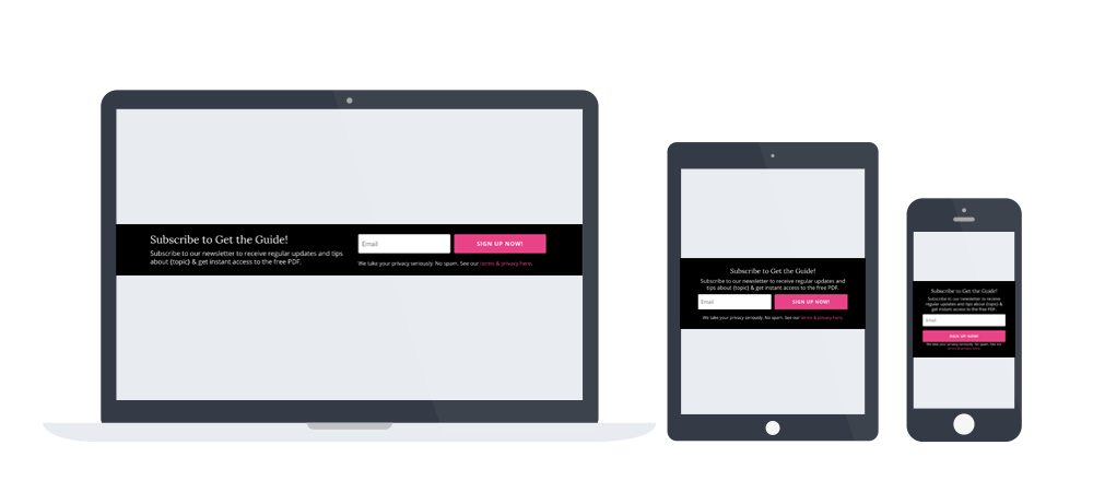
1. Slim signup form with single input field
If you are going to use single e-mail field in your optin form, add a custom CSS class of dl-slim-optin1 and use this CSS code:
.dl-slim-optin1 .et_pb_newsletter_footer {
	flex-basis: 100%;
	margin-top: 0;
	font-size: 80%;
}
.dl-slim-optin1 .et_pb_newsletter_field,
.dl-slim-optin1 .et_pb_newsletter_button_wrap {
	flex-basis:49%;
}
@media (max-width:980px) {
	.et_pb_column_4_4 .dl-slim-optin1 {
		display:block;
	}
	.dl-slim-optin1 .et_pb_newsletter_description,
	.dl-slim-optin1 .et_pb_newsletter_form {
		width: 100%;
		padding: 0;
	}
	.et_pb_column_4_4 .dl-slim-optin1 .et_pb_newsletter_description {
		margin-bottom: 10px;
		text-align:center;
	}
	.dl-slim-optin1 .et_pb_newsletter_footer {
		text-align:center;
	}
}
@media (max-width:479px) {
	.dl-slim-optin1 .et_pb_newsletter_field,
	.dl-slim-optin1 .et_pb_newsletter_button_wrap {
		flex-basis:100%;
	}
}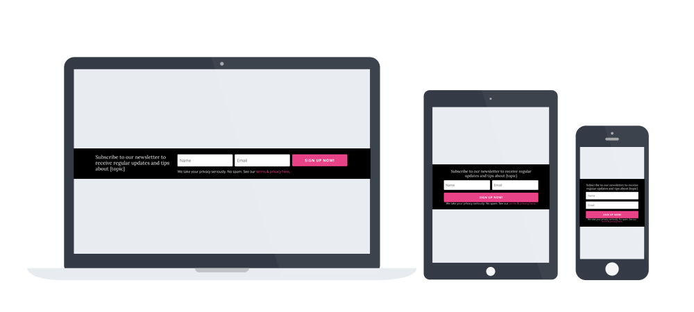
2. Slim signup form with two input fields
If you are going to use both e-mail and name field in your optin form, add a custom CSS class of dl-slim-optin2 and use this CSS code:
@media (min-width:981px) {
	.dl-slim-optin2 .et_pb_newsletter_description {
		width: 30%;
	}
	.dl-slim-optin2 .et_pb_newsletter_form {
		width:70%;
	}
}
.dl-slim-optin2 .et_pb_newsletter_field,
.dl-slim-optin2 .et_pb_newsletter_button_wrap {
	flex-basis:32.5%;
}
.dl-slim-optin2 .et_pb_newsletter_footer {
	margin-top:0;
}
.dl-slim-optin2 .et_pb_module_header {
	padding-bottom:0;
}
@media (max-width:980px) {
	.et_pb_column_4_4 .dl-slim-optin2 {
		display:block;
	}
	.dl-slim-optin2 .et_pb_newsletter_description,
	.dl-slim-optin2 .et_pb_newsletter_form {
		width: 100%;
		padding: 0;
	}
	.et_pb_column_4_4 .dl-slim-optin2 .et_pb_newsletter_description {
		text-align:center;
		margin-bottom:10px;
	}
	.dl-slim-optin2 .et_pb_newsletter_footer {
		text-align:center;
	}
}
@media (max-width:600px) {
	.dl-slim-optin2 .et_pb_newsletter_field {
		flex-basis:49%;
	}
	.dl-slim-optin2 .et_pb_newsletter_button_wrap {
		flex-basis:100%;
	}
}
@media (max-width:479px) {
	.dl-slim-optin2 .et_pb_newsletter_field{
		flex-basis:100%;
	}
}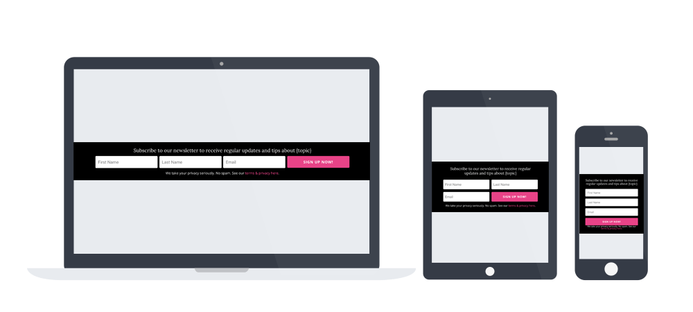
3. Slim signup form with three input fields
If you are going to use all of the default Divi Optin Module fields: first name, last name and e-mail field in your optin form, add a custom CSS class of dl-slim-optin3 and use this CSS code:
.dl-slim-optin3 .et_pb_newsletter_field,
.dl-slim-optin3 .et_pb_newsletter_button_wrap {
  flex-basis:24.5%;
}
.dl-slim-optin3 .et_pb_newsletter_footer {
  margin-top:0;
}
.et_pb_column_4_4 .dl-slim-optin3 {
  display:block;
}
.dl-slim-optin3 .et_pb_newsletter_description,
.dl-slim-optin3 .et_pb_newsletter_form {
  width: 100%;
  padding: 0;
}
@media (max-width:800px) {
  .dl-slim-optin3 .et_pb_newsletter_field,
  .dl-slim-optin3 .et_pb_newsletter_button_wrap {
    flex-basis:49%;
  }
  .et_pb_column_4_4 .dl-slim-optin3 .et_pb_newsletter_description {
    margin-bottom:10px;
  }
}
@media (max-width:479px) {
  .dl-slim-optin3 .et_pb_newsletter_field,
  .dl-slim-optin3 .et_pb_newsletter_button_wrap {
    flex-basis:100%;
  }
}

Hi, sorry to post on an old thread – would you have any idea why the slim email form is working perfectly on a homepage design, but not on any other pages on the site?
Home:
Product:
Any ideas what I’m doing wrong – I’ve tried everything I can think of? Many thanks!
Could you post the URLs again? It looks like it got removed..
Hi, thanks for getting back to me!
http://sguk.futra.co.uk
http://sguk.futra.co.uk/index.php/product/laureato-42mm-ceramic-skeleton-8/?et_fb=1&PageSpeed=off
Try with:
@media (min-width:600px) {
.dl-slim-optin1 .et_pb_newsletter_field,.dl-slim-optin1 .et_pb_newsletter_button_wrap {
flex-basis: 48%!important;
}
}
Superstar!!! Thank you so much 🙂
This is exactly what I was looking for. Thank you!
Hi! Do you know why all of my fields are aligned right and not coming out inline horizontally?
Thank you so much for this! Do you have a version that addresses the addition of custom field options? I have 2 input fields but 4 custom field checkboxes and it is making my option form very wide.
http://kennethtemple.com/wp-content/uploads/2019/09/Screen-Shot-2019-09-03-at-6.46.30-PM.png
No, sorry, no premade layout like yours. You should try targeting the checkbox wrapper elements and setting their “display” property to “inline-block”.
Wow such a quick response. Thank you so much for your time and response. You are amazing. I’m not sure what you are recommending but I will give it a try. I appreciate your help!
Hi, I’m looking to change the size of the button in the e-mail optin module. I don’t want it with the same width of all the fields (because now it have the 100%), I want it smaller.. I have try it with:
.et_pb_newsletter_button{
width:30% !important;
}
but it doesn’t work. Can you help me please?
Thanks!
Can you share a link to your site?
hi without changing anything the optin footer text ( We take your privacy seriously. No spam. See our terms & privacy here.)does not show at all
Great stuff! Just one thing, is there a way of reducing the width of the sign up button in comparison to the fields?
This is really great Ania. I had look for this several time. I have a small glitch when i pass under 980px.. fields does not show align well. In dev mode on chrome it look ok but in reality no. Any idea how to fix that Ania??
http://joseebouchard.com/nouvelle-page-daccueil-2/
pw: dev
Hi, please try adding a min-width property in this part of CSS:
It worked like a charm Ania! One question still remaining. Why do you use flex-basis? I tried without it, only with min-width and it doesn’t seems to make any difference?
By the way, are you giving or selling css formation?
Hi,
where do I have to put the CSS Code? In the Divi Theme Options?
And the CSS Class “dl-slim-optin2” in the Optin module?
Thanks a lot, Armin
Hi Armin, Yes and yes – theme options and optin module advanced tab.
Hi Ania, thanks for advice. It works for Laptop & Mobile – but on Tablets it looks weird. Any idea?
This was perfect…I’ll use this on several of my sites…this is the best solution I’ve seen yet!! Thanks!
Finally!
After checking dozens of solutions out there including elegant theme’s blog itself finally yours did the job!
Big five star Ania!
You saved me from installing Bloom!
Thanks for spreading good stuff around the web.
Hi
I have just tried using your slim opt and it looks lovely, but for some reason the Field and Button are sitting on top of each other?
Rather than side by side, see here: https://www.screencast.com/t/u8PqD5BH
Would you be able to point out my error?
Thanks
Hi Rob,
It’s hard to say without the link, but you might need to add some !important tags to the CSS to make it right.
The code (optin3) isn’t working properly. It basically looks exactly like optin1.
On Divi visual builder I am seeing the input fields, but on the live site they are gone. Any idea?
It’s most likely because you haven’t connected the module with any mailing list.
Wow very interesting
Where do we need to add the custom class?
On the section, Row or module ?
The custom CSS class should be assigned to an Email Optin module.
Love this – what a better one the one I had mocked up.
One issue on my WooCommerce page for a product, it’s broken. Looks not to be pulling the CSS through. Works on any page above product level – I have added this to the footer.
Any ideas?
It’s hard to guess why it won’t work… but it would depend on what method did you use to add it to your woocommerce pages.
Thank you – I built a custom footer in Divi, changed the footer.php to add this new footer to all pages as the default footer. Footer saved as library item.
you can look here:-
main page – http://wtddev.co.uk/wickeddistribution/
single product page – http://wtddev.co.uk/wickeddistribution/shop/quad-bikes/hawkmoto-125cc-condor-4-stoke-quad-bike-blue-w-reverse/
This is a keeper! However, I’m really surprised that Divi doesn’t offer this design as an “out of the box” option.
This is brilliant! I spent quite some time trying to help someone get their divi theme to do this. And then they spent time with Divi support and your email came out several days later. I just implemented it on another site and it’s brilliant! Thank You!
Just looked at one of my older client sites today and realised my original slim optin css was broken. This saved me, and it looks better than it ever did.
Thank a lot!
Good stuff! I’ve been looking for an alternative to Bloom, and this is just the ticket.
I agree, with this wonderfull CSS and the Divi optin option don´t need to add another plugin
The email optin error message is not translated…
Any idea?