
Simple and Attractive Hover Effects in Divi
Last week I shared with you an About Me Page Layout. If you haven’t seen it yet, you can check it out here! And while you’re at it, look closely at the hover effects I’ve applied in the layout.
Today, I will show you how to achieve these hover effects with simple CSS code snippets. You can watch the video to see how to apply these hover effects to your Divi-based website. And you can find the CSS code and short explanations in the tutorial below. So let’s hover!
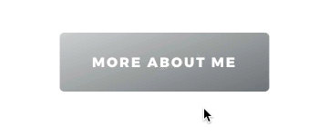
1. Divi Button hover effect
There is a lot you can do in terms of button hover effects and that’s probably something I should discuss in a separate article. But here we’re going to make two specific changes: we’ll subtly increase the size of the button and add a shadow to make a fun 3d effect!
When you hover over it, the button grows bigger and looms closer, like it’s jumping over the background.
You can apply this CSS to any module, because making it bigger and adding a subtle box-shadow on hover is always nice.
.dl-hover-grow:hover {
	transform:scale(1.05) translateY(-3px);
	box-shadow:1px 15px 35px -10px rgba(0,0,0,0.4);
}
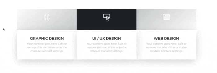
2. Hover effects on Divi Columns
Look at the “What I do” section. Each column consists of two modules: blurb (for the icon) and text (on a separate background). But when you use this hover effect, it creates the illusion that each column is one element. It creates a clean, uniform look. And you can have fun making those columns jump!
.dl-column-up .et_pb_column {
	transition: all .3s ease-in-out;
}
.dl-column-up .et_pb_column:hover {
	transform:translateY(-10px);
}
3. Changing one element while hovering over a Section
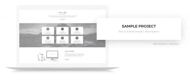
You can add a hover effect to the whole section or row in such a way that it’ll affect just one element within it. Take a look at “Recent Project” in the layout. When you hover over one row, only the image changes. What’s exceptional about it is that the hover effect on the image will be activated whenever you place your cursor within the row. It doesn’t have to go directly over the image.
.dl-row:hover .et_pb_module {
	/* your CSS */
}
Reverse Image Filters on Hover
Now, that’s a fun idea! You’ve probably been wondering how I achieved this coloring-in hover effect in this section. No, I haven’t added any complicated custom CSS to create this effect. Instead, I’ve reversed the process.
You can add some filters to the image the way it’s normally displayed using Divi Module options (I decreased the saturation and opacity and added some blur), and simply remove the filter on hover using the simple CSS declaration: “filter:none;”. This way, your image will magically unblur and color-in on hover!
.dl-row .et_pb_image {
	transition: all 1s ease-in-out;
}
.dl-row:hover .et_pb_image {
	filter: none!important;
}
@media (max-width:980px) {
	.dl-row .et_pb_image {
		filter:none!important;
	}
}
5. Hover Effects for Element Inside a Module
If you want to add a hover effect to just one element inside a module, like an icon in a blurb or a social media icon, you need to use your browser’s Inspector (Developer Tools). We do this to check the CSS class of the element you want to change on hover. The custom CSS class which we’ll be adding in the Advanced Tab will affect the whole parent container. And we don’t want the whole blurb to change - just the icon.
.dl-social li a.icon:before {
	font-size:30px;
	transition: all .3s ease-in-out;
}
.dl-social li a.icon:hover:before {
	transform:scale(0.8);
	color:#fff;
}

.dl-blurb .et-pb-icon {
	transition: all .3s ease-in-out;
}
.dl-blurb:hover .et-pb-icon {
	transform:scale(0.8);
}
Final thoughts
Hover effects are so much fun! But no matter how much you love them, remember to be subtle and consistent. These microinteractions are useful and attractive, but if you overdo them, the effect may work against you.
What do you think about these hover effects? Have you tried some of them? Let me know in the comments!


May I know the hover effect on your own website homepage with the images stacked over each other and the one which is hovered pops up please
Yet again, another useful tip, I’ve used so many so far from you Divi Lover, thank you. THANK YOU!
I love your tutorials! I almost gave up on Divi until I found your website!
Seeing all the wonderful things you can do with Divi makes it my top choice!
The hover effects in this tutorial are gorgeous!
it was very useful thanks …
Hi Ania
Very simple CSS but adds great effects.
Thanks for sharing.
Love it, beautiful transitions. Thanks for teaching us how to achieve this!
Cooool! love this kind of effects, thank you….
Very nice. Thanks. I will try couple of these on my next project.