
The user-scalable=”no” problem in Divi – and how to fix it fast
You know that moment when you proudly run your freshly built Divi site through Google PageSpeed… and there it is – same accessibility error appears every time:
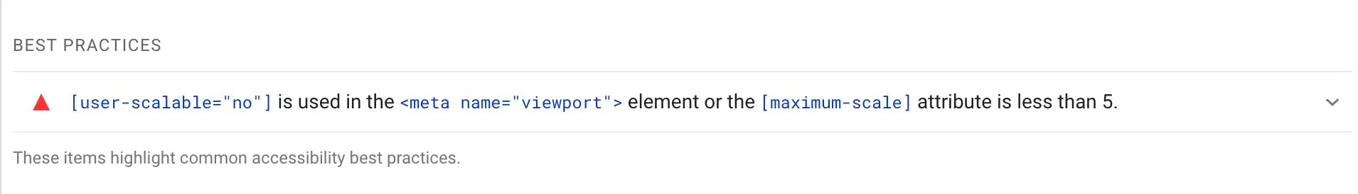
“user-scalable="no" is used in the <meta name="viewport"> element or the [maximum-scale] attribute is less than 5.”Ugh. Really, Divi?
The good news? This one’s super easy to fix. Just a tiny code snippet – and your site becomes more standards-compliant (and scores better, too). In this post, I’ll show you:
- Why this error happens
- Whether it actually matters
- And how to fix it – in under 5 minutes
No plugin bloat, no theme-breaking drama. Let’s go!
First things first: why is this even a problem?
Out of the box, Divi adds this line in your site’s <head>:
<meta name="viewport" content="width=device-width, initial-scale=1.0, user-scalable=no">Which basically tells mobile browsers: “Hey, don’t let users zoom.”
Now, here’s the thing: Most modern mobile browsers ignore that instruction anyway.
Chrome and Safari on iOS and Android typically allow users to zoom even when user-scalable=no is present.
So why does Google PageSpeed complain?
Because technically, this tag violates accessibility best practices. It restricts zooming – something that’s essential for users with visual impairments. So even if it doesn’t block pinch-to-zoom in practice, it’s still flagged as a potential issue in audits.
Bottom line:
This fix won’t suddenly make your site feel different on mobile, but it will clean up your PageSpeed report and align your site with WCAG guidelines.
The fix: allow zooming with one simple code snippet
We’ll replace Divi’s default viewport tag with one that’s more accessibility-friendly:
// Allow scaling to improve accessibility

function remove_et_add_viewport_meta_action() {
    // Make sure the action is removed after Divi hooks in
    remove_action('wp_head', 'et_add_viewport_meta');
}
add_action( 'wp_loaded', 'remove_et_add_viewport_meta_action' );

function custom_et_add_viewport_meta(){
    // Output the custom viewport meta tag
    echo '<meta name="viewport" content="width=device-width, initial-scale=1.0, maximum-scale=5.0, user-scalable=1" />';
}
add_action( 'wp_head', 'custom_et_add_viewport_meta' );
Where to add it? You have two options:
- In your child theme’s functions.php
(If you’re using a child theme – nice!) - Or use a plugin like Code Snippets
This is the easiest and safest way to add PHP code – no editing files, no stress.
And lately, my favorite snippet manager (shared by one of my awesome Divi Stylist Academy students!) is:
✨ Fluents Snippets – lightweight, reliable, and works beautifully with Divi.
What happens next?
After adding the code:
- Google PageSpeed will stop flagging this as an accessibility issue
- Your
<head>will output a more WCAG-friendly meta tag - You’ll be just a bit closer to having an inclusive, audit-passing website
It’s a small fix – but if you’re working with client sites or optimizing for top scores, it’s worth doing.
Looking for more quick wins for accessibility?
Check out this beginner-friendly guide full of practical tips:
👉 How to Make Divi Sites More Accessible (Simple Tips for Beginners)
Have questions? Need help adding the snippet? Or have a favorite plugin for custom code? Drop a comment – I’d love to hear from you!


Hello Ania,
Thank you very much for the code snippet – integrated into the Divi child theme, it achieved a 7% improvement in Lighthouse…