404 Error Page Inspiration
A 404 page, if done right, can enhance the user experience of a website and also become a memorable aspect for website users. Some websites even become famous for their cute, entertaining, or creative 404 pages. We’ll show you some examples of the most popular error page motifs, and also some of the most interesting, brand-fitting 404 pages we’ve encountered.
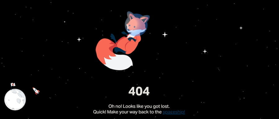
Lost in space
This is quite a popular motif, and it’s easy to see why. Many 404 pages use the metaphor of being lost or off the beaten track, and as the Internet is a cyberspace, an entity as borderless as outer space, this metaphor is rather apt. Being lost on the Web might be just like being lost in space, except that you can get back on track with just one click. Each of the amazing pages we found conveys the cosmic vibes in a different way – see for yourself!
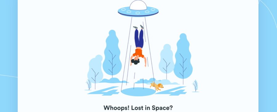

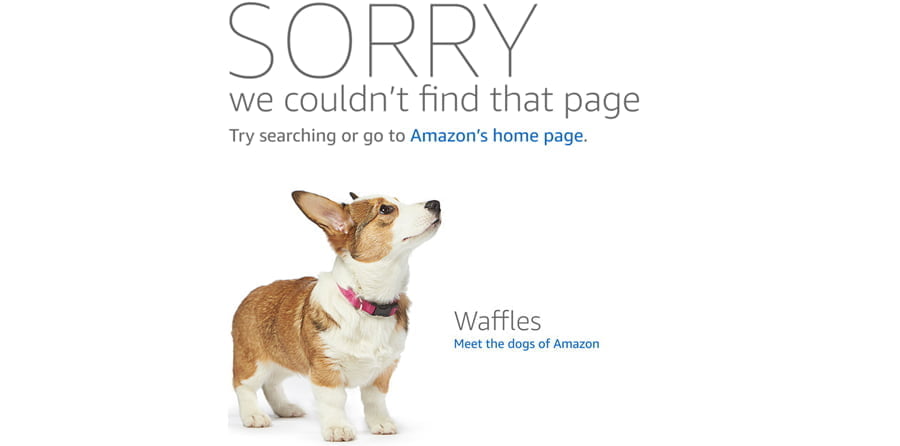
Cute animals
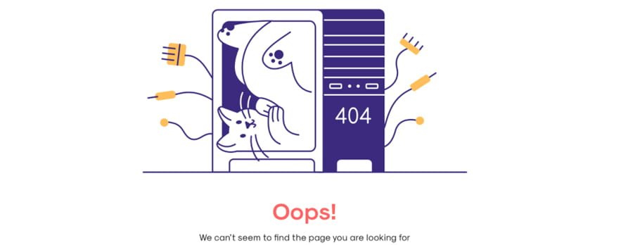
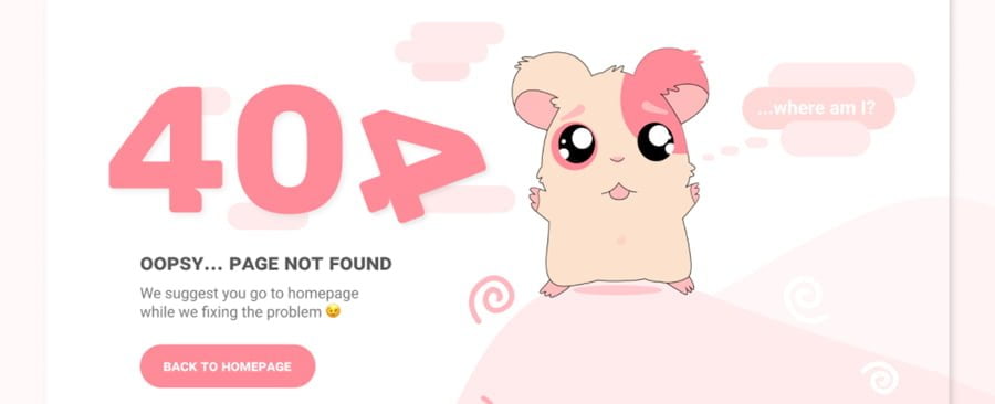
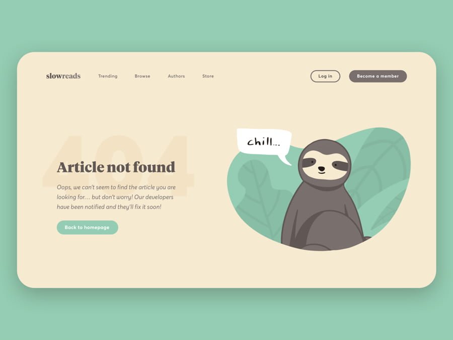
It’s the Internet, and that means you can’t go wrong with a cute cat, a dog, or even a hamster! A 404 page featuring a cute animal will bring a smile to the face of anyone who sees it, so this is a good bet! This is a type of a 404 page which doesn’t necessarily urge the visitors to be on their way. A cute animal may encourage them to stay and catch a breath in their busy day, promoting associations of well-being or amusement.
Travel-themed creative 404 pages
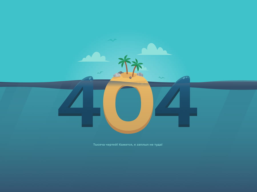
The motif of travel is also quite popular. If a website is a certain space that you travel through, clicking from one page to another, the 404 page is the equivalent of being lost on your way. The examples we picked feature vivid colors and beautiful imagery. While really eye-catching, these error pages don’t encourage visitors to linger.

Catch a break
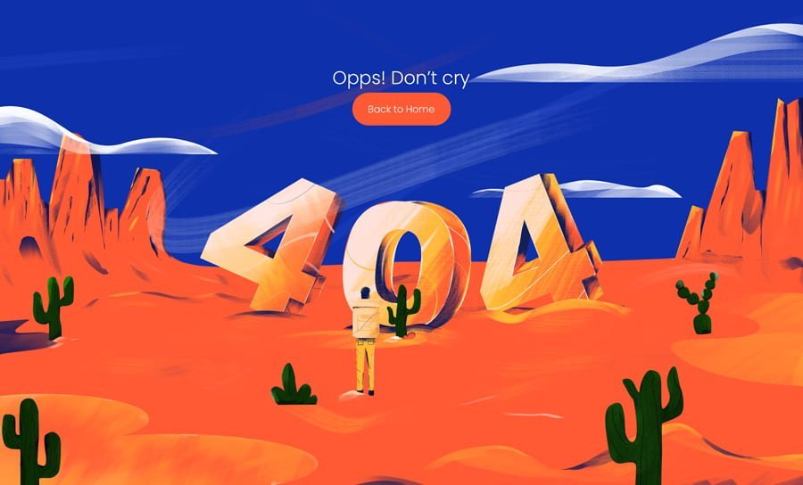
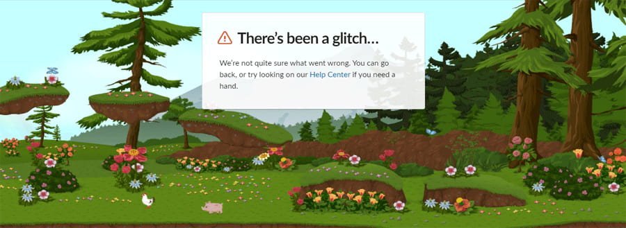
And there are also some very zen 404 pages which invite website users to stop for a moment and catch a break. Enticing with bucolic or fantastic imagery and intriguing concepts, they draw the stray visitor in, offering a moment to stop and wonder. They are definitely on the memorable side and should produce positive associations.
Brand-fitting creative 404 pages
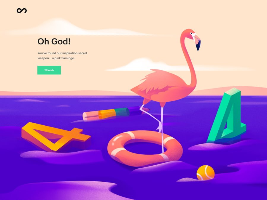
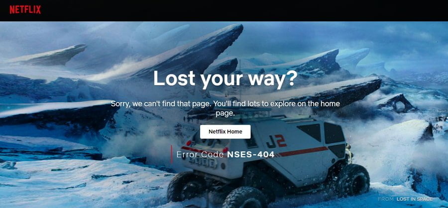
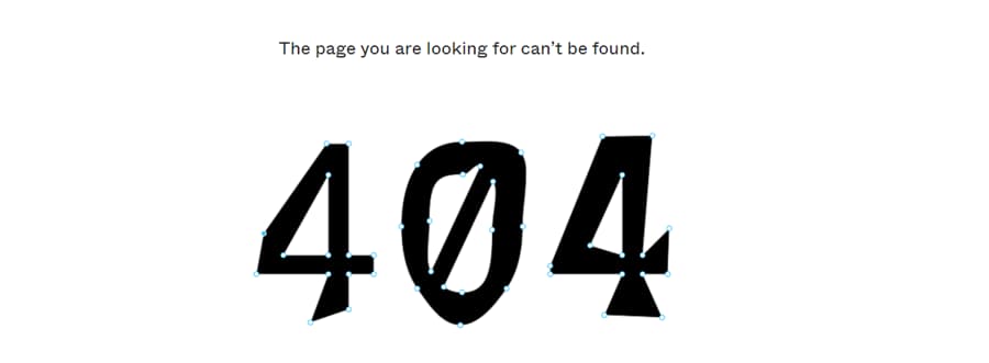
Last but not least, we will show you some truly excellent examples of brilliant 404 pages. Their genius lies not in an apt metaphor or concept, but in the way in which each of these pages is such a perfect fit for the website’s brand. They are truly custom and made to order, and rarely replicable. To achieve a similar effect, a web designer would need to do a ton of brainstorming and creative work with a particular brand, but the effects are well worth it. Judge for yourself!

Final thoughts
And that’s it! We are sure the Web abounds in many more amazing, creative 404 pages, and we might even start putting nonsense into the address bar on purpose just to discover even more amazing examples. Or maybe you have some inspiring 404 pages saved up somewhere? Share them with us in the comments!



They are “creative” but more use to the visitor is to put a sitemap on the 404 to help them find what they were looking for.
It would be useful if there was a way to log the address that sent them to 404, maybe that would identify an issue you could fix.
This is a great insight, thank you! Of course, this approach might be very helpful and valuable to target users.
Definitely aligned with the Netflix and Figma brand, AWESOME 🙂
They really are! I’ve been playing with the Figma one more than I want to admit ^^