A Call to Action – CTA for short – is a necessary element of every marketing strategy, and every website. Without a compelling Call to Action, even the best designed website or ad campaign will fail. In this article, we will focus on CTAs for websites, but of course, they are used in many other areas, too.
What’s a CTA?
A Call to Action is a short, direct invitation for website users to do something. It will usually appear as a short line of persuasive text followed by an eye-catching button with an imperative text, such as BUY NOW, SUBSCRIBE, or DOWNLOAD – this is the CTA button.
Usually, the CTA appears at the bottom of an ad copy – a longer text in which you show its readers the benefits of the action you want them to take. So, if you want them to BUY NOW, you’d usually precede the CTA with some text telling them how the product or service you’re selling will improve their lives.
Your CTA, for example, might consist of a line or a few explaining the details of the deal you’re offering, such as: Get the bestselling new software at 30% OFF, only today! And then: BUY NOW.
So, when talking about the CTA, we will mean the longer line, and when talking about the CTA button, we will mean the short, direct message.
The CTA’s purpose is to make it easy for your website users to make a decision. And web users expect a CTA. They need that big, attention-grabbing button to show them where to go. If you want your website users to do something, whatever it is, you need a compelling CTA. But how to write it?
Make it simple
The CTA button itself should be very concise, just 2-3, rarely more words. For one, it makes the massage very simple and easy to understand. And two, it looks better.

The contents of the button and the preceding Call to Action text depends on what you want to achieve. If you’re selling something, the action is obvious: BUY NOW. If you want to grow your mailing list, the action is to SUBSCRIBE. If you’re writing a blog, your CTA will likely be READ MORE.
To boil your goal down to that short, direct message, you need to get clear about what you want your website users to do. And then, just tell them in simple, convincing words to do that action. Use short, direct words. CTA is usually not the place to get creative, because every nanosecond your users will spend deciphering the meaning of your message will bring them further away from clicking that button.
Keep them focused and engaged. Use simple words.
Make the benefit clear
A CTA should be short, very clear, possibly detailed, and easy to read. A tall order, I know. So first, you need to identify the benefit your target user will get from doing as the CTA says.
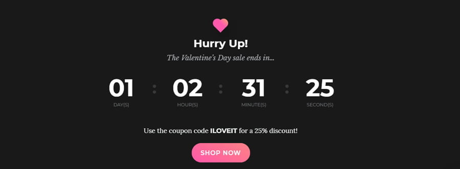
They might get something for free, in which case you get to use the magical, very compelling word FREE. Or they might get something at a discount, which means you can use other compelling words, such as SALE, 25% OFF, DISCOUNT etc.

There are other benefits users can get. If you’re selling a product or a service, define the most important problem it solves or the most dramatic improvement it can make, and highlight it in your CTA.
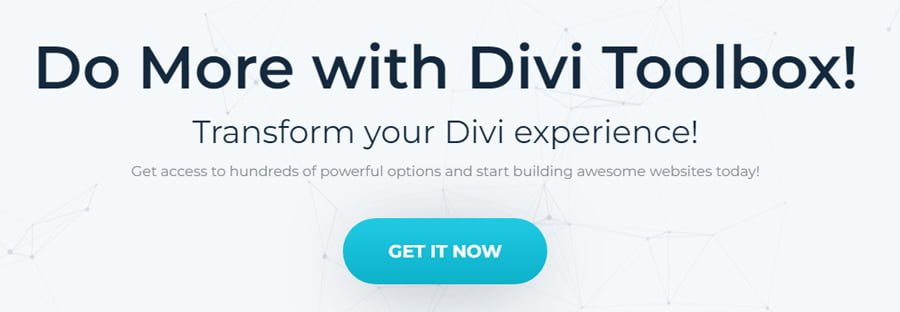
The benefit can be knowledge, if your goal is to make the target user read a blog post or a news item. In this case, enticing them to Learn more about… should work. Or, if your CTA is inviting website users to DONATE, you can show them the impact of their donation.

Be urgent and specific
Then, you might add a sense of urgency with words such as HURRY UP, DON’T MISS, ONLY TODAY, LIMITED TIME ONLY. You might even include a countdown to drive the message home.
This plays on FOMO, the fear of missing out, which most people have. If something is only briefly available, we are more likely to get it because we are afraid of missing out on something great. Follow the direct, clear message with a CTA button, telling everyone to click NOW. It sounds almost too easy, but it works.
Another strategy to make the CTA more convincing is to use specific numbers. If it’s a sale, make sure to include how much of a discount you’re offering. If the goal is donation, you can state what kind of impact a specific amount will have. If you’re selling an online course, tell your clients the amount of time in which they are likely to complete the course and change their lives.

And if your goal is to invite users to engage, for example by commenting on a blog post or leaving a review, you can ask them a question before you tell them to LEAVE A COMMENT. Most people are more likely to engage if they are asked something specific.
Make it sound good
A good CTA will have all the above elements, so it will be simple, specific, and contain a clear benefit. But the best CTA, apart from these elements, will also easily roll off the tongue. It’s actually very simple to check for this quality. Just read your CTA out loud!
If your tongue snags on a word, if you have to do a double take, if you pause or stutter – it might indicate a problem. A word may be too long or too short, the rhythm may be off… Whatever the reason, it is best to fix it.
The perfect CTA will be very easy, intuitive to read. That also means it will be easy to understand and quick to sink in.
So this is it! And if you’re still feeling stumped for ideas or don’t have time to design your CTA strategy, we have good news! If you build your website using a premium child theme, you will see that many of the ready-made pages are already optimized for the best flow of information, with CTAs strategically positioned in the most beneficial places! For example, take a look at our premium child theme Girly’s sales page. It’s been designed in a way that only requires you to replace the texts with your own and maybe do some minor customizations. Pretty neat, right?
How is this for a compelling Call to Action?
I hope these tips will be useful and help you write compelling CTAs for your website! Now, if you were to encourage us to visit your website or blog, what CTA would you use? Tell us in the comments 🙂
0 Comments