Learn how to implement CSS Grid Model inside the Divi Builder
There are situations when you want to present a grid-based layout within your Divi website. Unfortunately, we are limited to a standard, row-based structure (if we don't want to use custom code). Luckily, with just a few lines of CSS, you can implement beautiful grids on your Divi website!
Watch the step by step video below to see how easy it is to use CSS Grid in Divi:
Step 1
Add the Content Structure
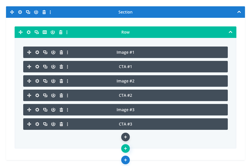
Think "mobile first". Use the single-column Row and place your modules in the order you'd want them displayed on phones. You can use any type of modules, but note that if you'd like to include images inside the grid, I recommend using the 100% height Divider module and assign your image as the module background.
Step 2
Name the Grid Areas
Use the grid-area property to define the name of each grid "tile" and use custom CSS classes to conect the grid area names with the correct modules. The CSS class and the name doesn't need to be the same..image1 {grid-area:image1;}
.image2 {grid-area:image2;}
.image3 {grid-area:image3;}
.cta1 {grid-area:cta1;}
.cta2 {grid-area:cta2;}
.cta3 {grid-area:cta3;}Step 3
Define the Grid Structure
The grid needs to be applied to the parent container. When using Divi modules as grid items - the closest parent container is the Column. We can add the CSS class of dl-grid directly to the column settings within the builder and then use this CSS to define the grid:.dl-grid {
display:grid;
grid-template-columns:1fr 1fr 1fr;
grid-template-areas:
"image1 image2 cta1"
"image1 cta2 image3"
"cta3 cta3 image3";
grid-gap: 10px;
}Step 4
Modify the Structure for Tablets
Define a new media query to target smaller screen sizes. Decide which module whould go where and how many columns your grid needs. In the example below, I've changed the grid to two-column layout and modified the position of grid items:@media (max-width:980px) {
.dl-grid {
grid-template-columns:1fr 1fr;
grid-template-areas:
"image1 cta1"
"cta2 image2"
"image3 cta3";
}
}Step 5 (optional)
Disable the Grid for Phones
You could define a new grid structure for smaller screen sizes, but if you're ok with displayin full-width modules on phones, then you can disable the grid using this bit of CSS:
@media (max-width:767px) {
	.dl-grid {
 		display:block;
	}
}
Final Thoughts
I hope you like this approach and this walkthrough.
Sign up for the newsletter so you don't miss out on any Divi tutorials and feel free to download the sample Grid-based Layout Set. Also, keep an eye out for future Divi freebies! As always, please leave a comment with your thoughts below! I hope you'll find this useful.


Hey Ania, just downloaded the Grid-based Layout Set. Where schould I import it?
Got it!
Thanks, Ania, as always very well explained and sweet result.
Hi Ania – a great tutorial which I use a lot but today discovered how I can change the modules’ appearance on hover! I just give two modules the same CSS class (image1) so that they appear in the same grid space on top of each other, then using the Opacity Filter I can toggle which one is visible on hover. One module is set to 100% on hover while the other is 0% on hover – in the filter settings. Works really well!
exelente ania, muy buena tu forma de explicar gracias
We love you, Ania! Thanks a lot!
Hi Ania, thank you for the great content. I love the CSS grid layout pack.
I was wondering how to use the layout to keep two columns on mobile ?
Just skip the 5th step listed in the article. Remove the last bit of CSS which changes the display type to “block” for phones.
Thank you. works lovely now
OMG Hats off to you. amazing layout! Keep it up Ania. Love your work …
awesome ! I use the CSS grid when I create sites without CMS and that’s fine. I am happy to be able to use it now with divi. thanks a lot
Great tutorial Ania! Many thanks for it and the free grid layout set!
You’re welcome, Roland! I’m glad it’s helpful 🙂
Great usage of css grid in Divi.
A couple of months ago I managed to build a grid-like layout with divi ( http://jcgrafik.com/) for a friend of mine. If I had read this before it would have been a lot easier.