Create vertical navigation in the footer using the standard Menu Module in Divi
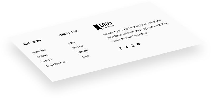
Divi's Menu Module, by default, uses the horizontal layout, was designed for the Header as the horizontal navigation. But there are certain situations (when creating a Footer or a Sidebar layout, for example) when we'd like to display all the menu items vertically, as a simple list of links, without the hamburger mobile menu version.
Yes - we can use the Text module and add our list of links manually, but using the WordPress Menus when selecting links is more user-friendly and opens up additional possibilities.
In this short walkthrough, I'll show you how to use a few lines of CSS to change the default Menu module appearance and how to add a fun hover effect to your menu links!

This Sample Footer Layout is available to download for free to our subscribers.
Free Resources for Divi Lovers
Access this layout and dozens of other freebies - available exclusively for newsletter subscribers.
New here?
Join the newsletter to unlock the Freebie Library and get weekly Divi tips, tutorials, and design goodies.
Already subscribed?
Go straight to the Freebie Library and download this layout - plus lots more!
Change the Menu alignment with CSS
To target a specific module, and not all Menus on the entire website, we've added a custom CSS Class in the Menu's Settings, Advanced section: dl-v-menu. This bit of CSS changes the alignment of that menu and hides the default Mobile menu version with the hamburger icon.
.dl-v-menu .et_pb_menu_inner_container,
.dl-v-menu .et_pb_menu__wrap,
.dl-v-menu .et_pb_menu__menu,
.dl-v-menu.et_pb_menu .et_pb_menu__menu>nav,
.dl-v-menu.et_pb_menu .et_pb_menu__menu>nav>ul {
    display: block;
}

.dl-v-menu .et_mobile_nav_menu {
    display: none;
}
Add hover effect to Menu items
Here's an example of a fun hover effect, which adds a gray animated line next to the menu item and slighly moves the link to the right.
.dl-v-menu a:before {
    content: '';
    background: gray;
    display: block;
    position: absolute;
    width: 10px;
    height: 2px;
    top: .6em;
    left: -20px;
    opacity: 0;
    transition: all .3s ease-in-out;
}

.dl-v-menu a:hover:before {
    left: -10px;
    opacity: 1;
}

.dl-v-menu a:hover {
    padding-left: 5px;
}
Final Thoughts
Don’t forget to check out the demo page to see the sample footer layout and vertical menu navigation with the hover effect in action!
Sign up for the newsletter so you don't miss out on any Divi tutorials. Also, keep an eye out for future Divi freebies. If you're a subscriber feel free to download the Footer layout I created as an example.
As always please leave a comment with your thoughts below! I hope you'll find this helpful.


Thank you for this wonderful tutorial. Can you please provide Javascript code so we can make submenu open open on click. Thank you
You might want to check this tutorial. 😉
Download link doesn’t work just loops.
Also subscribe to newsletter link does not work either. It just sends to a blank page.
This is my first time here and I love the design of this site, however broken links I never good. Especially when it’s on a page that is supposed to be a tutorial for menus and links
Hello Ocean,
I’m sorry to hear you have trouble accessing the free layout. I checked and it looks like your email address is already on our list, so if you fill the sign up form, it should redirect you to the download page automatically.
Hi, I had two question about using this – currently the nested menu only lets me click on the lower most child menu item, so the top level isnt clickable as a link – is it possible to do this?
Also, is it possible to have them collapsible – so that you can click the parent element or open the sub menu?
Many thanks in advance 🙂
Hi Will,
Yes, I’m afraid this solution doesn’t really work well with sub-menus. We’re going to have a separate tutorial on this, as it’s pretty complex and would be difficult to explain in the comments. Stay tuned 😉
Hello, I have a problem with the the vertical menu. I would like to align the vertical menu to the h2 “MENU” but I can find the solution. I have tried text-align and other functions but the menu still being aligned to the right. How can I do it?
Thank you!
Are you able to show which part of the css does which thing?
Specifically I assume this part is the dash which appears?
width: 10px;
height: 2px;
could that be replaced with a character, say a bullet point or arrow?
We’re doing it step by step in the video, so the CSS should be clear 😉 To change the dash to an icon, you’d need a “content” and a “font-family” property on the ::before element.
This is perfect Ania, especially in combination with the Canvas header (second section). Is there also a way to have submenu items? I have submenu items in my menu, but it shows one list now.
Hi Stephanie,
This bit of code would display the submenus underneath each parent menu item:
To make it collapisble, we would also need to add some JavaScript (I will create a separate tutorial about it).
Super Lösung, vielen Dank! Ich habe ebenfalls Untermenüpunkte und würde sie gerne rechts zur Seite ausklappen:)
Thank you Ania!
greetings,
this is exactly what i needed and solved my problems! i noticed in the visual builder, when it resizes for mobile dimensions the featured images in the filterable portfolio become inverted.
Hi Ania
This looks fantastic and is just what I am looking for. but when i try and upload it just hangs at 99% and doesn’t finish the import
I love this! But how can I get the text to right align instead of left align? With display:block; the text-align:right; doesn’t work 🙁
You probably just needed a more specific selector. Try with this:
Ah, perfect. That worked!
I love this! Thanks for providing this code. Quick question… how do I center this on mobile?
Something like this should do it:
Perfect! Thank you.
Hi Ania,
It’s so simple but very effective, I love it!
I have a suggestion for a tutorial snippet – how to make a tooltip (another module) appear on a button hover and positioned near or at the button.
Thank you, Hurri! I’ll see what I can do 😉