Ready to take your website’s navigation to the next level? This is an in-depth walkthrough tutorial on creating a sleek One-Page Menu Navigation with Active Anchor Links in Divi. This advanced tutorial uses jQuery and CSS, but don’t worry, I’ll explain everything step by step.
In the video, you’ll learn how to set up a smooth scrolling navigation menu that highlights active sections as you scroll. And in this blog post, I’ve included code snippets that you can easily copy and paste to get this effect on your own site.
Important!
This tutorial was streamed live inside the Divi Stylist Community, an exclusive online space for Divi Stylist Academy students. If you’d like to master professional web design and coding with live support, as well as take part in inspiring live events inside the community, check out Divi Stylist Academy.
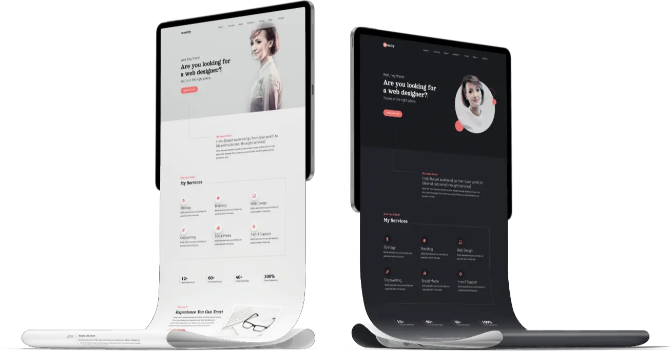
Excited to see this in action? Check out our brand-new Divi Child Theme, Identity. It features a stunning one-page design using this exact navigation setup. Click below to see the demo and experience the seamless scrolling for yourself!
Simple Version
Step 1
Add a CSS class of dl-anchor-menu to a Menu or a Text module.
Step 2
Add the following JavaScript code to your child theme. If you rather use the Theme Options Integration tab, or a Code module, wrap the code inside a <script> tags:
jQuery(document).ready(function($) {

	// Cache the link elements
	var navLinks = $('.dl-anchor-menu a');

	// Add a scroll event listener to the window
	$(window).scroll(function() {

		// Get the current scroll position
		var scrollPosition = $(this).scrollTop();
		var windowHeight = $(window).height();

		// Calculate the center of the screen
		var screenCenter = scrollPosition + windowHeight / 2;

		// Loop through each section
		$('div.et_pb_section').each(function() {
			// Get the position of the current section
			var sectionTop = $(this).offset().top;
			var sectionId = $(this).attr('id');

			// Check if the section crosses the center of the screen
			if (sectionTop <= screenCenter) {

				// Remove the "active" class from all links
				navLinks.removeClass('active');

				// Add the "active" class to the link corresponding to the current section
				$('.dl-anchor-menu a[href$="#' + sectionId + '"]').addClass('active');
			}
		});
	});

});
This code applies an active CSS class to each link within the module that has the dl-anchor-menu CSS class, but only if the link's URL contains the ID of the section currently visible in the viewport.
Step 3
Use the active CSS class to style the highlighted menu item. In the example below, we created a pseudo-element:
.dl-anchor-menu a::before {
	content:'';
	width:100%;
	height:3px;
	background: #000;
	display: block;
	position: absolute;
	bottom: -20px;
	opacity: 0;
	transition: all .3s;
}

.dl-anchor-menu a {
	position:relative;
}
.dl-anchor-menu a.active::before {
	bottom: 0;
	opacity: 1;
}

.dl-anchor-menu.et_pb_menu a.active {
    color: lightsalmon!important;
}
Extended Version
Step 1
Add a CSS class of dl-anchor-menu to a Menu module.Step 2
Add the following JavaScript code to your child theme. If you prefer to use the Theme Options Integration tab or a Code module, make sure to wrap the code inside <script>tags:
jQuery(document).ready(function($) {

	// Cache the link elements
	var navLinks = $('.dl-anchor-menu a');

	// Add a scroll event listener to the window
	$(window).scroll(function() {

		// Get the current scroll position
		var scrollPosition = $(this).scrollTop();
		var windowHeight = $(window).height();

		// Calculate the center of the screen
		var screenCenter = scrollPosition + windowHeight / 2;

		// Loop through each section
		$('div.et_pb_section').each(function() {
			// Get the position of the current section
			var sectionTop = $(this).offset().top;
			var sectionId = $(this).attr('id');

			// Check if the section crosses the center of the screen
			if (sectionTop <= screenCenter) {

				// Remove the "active" class from all links
				navLinks.removeClass('active');

				// Add the "active" class to the link corresponding to the current section
				$('.dl-anchor-menu a[href$="#' + sectionId + '"]').addClass('active');
			}
		});
	});

});Step 3
Add the following CSS code to style the animated highlight element, adjust the margin and height to match the size of your navigation..dl-anchor-menu li a {
z-index: 3;
}
#dl-anchor-active {
position:absolute;
transition: all .3s linear;
top: 50%;
margin-top: -20px;
margin-left:-11px;
height: 40px;
z-index: 2;
background: #eee;
border-radius: 30px;
}And that’s it!
I hope you enjoyed this tutorial and found it helpful! If you have any questions, comment below, and I’ll do my best to help you out.
If you have trouble with this tutorial or any other part of designing a website, I offer 1-on-1 web design assistance - check the options here!
And if you’d like to build a one-page website with this type of navigation fast, Identity is a great way to kickstart your project and save hours upon hours while gaining pixel-perfect, easily customizable design.


0 Comments