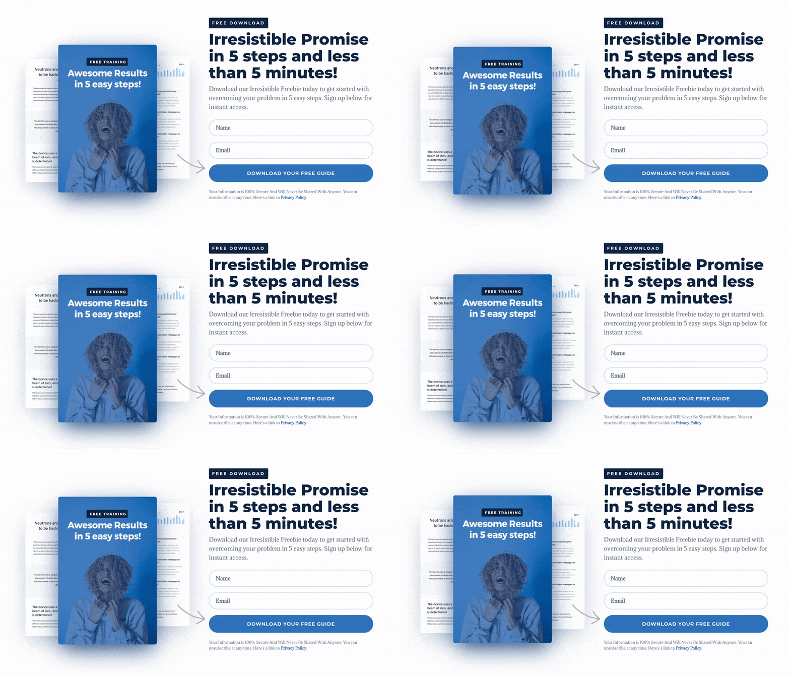
Learn how to create alluring Floating Images in Divi to make your content more catchy and attractive!
Animated images are a great feature that will distinguish your Lead Magnet Opt-in Page from others. In this tutorial, I will show you how to use Divi Builder to float elements and add life-like movement to your content.
We are going to use simple CSS animation to achieve that. Watch my step-by-step walkthrough video and make your images more engaging.

This Awesome Opt-in Layout Pack for Divi is FREE for our subscribers!
Free Resources for Divi Lovers
Access this layout and dozens of other freebies - available exclusively for newsletter subscribers.
New here?
Join the newsletter to unlock the Freebie Library and get weekly Divi tips, tutorials, and design goodies.
Already subscribed?
Go straight to the Freebie Library and download this layout - plus lots more!
Copy the CSS code!
If you'd like to recreate this layout yourself - it's very easy. Add a CSS class of dl-floating to a module, and then use this CSS to make it float!
@keyframes floating {
    0% {transform: translate(0,  0px);}
    50%  {transform: translate(0, 15px);}
    100%   {transform: translate(0, 0px);}
}

.dl-floating {
  animation: floating 7s ease-in-out infinite;
}

.dl-floating1 {
  animation-delay: -4.5s;
}

.dl-floating2 {
  animation-delay: -3s;
}
Additional CSS classes: dl-floating1 and dl-floating2 use aan animation delay, so that the module floats in an oposite direction. Hope you enjoy this quick CSS tip!
We always appreciate your feedback, so let us know in the comments what you think!


Hello Ania,
The subscribe form is not available, and link takes me to 404, could please assist.
Hi Romeo! Yes, the form was faulty for some reason, thank you very much for bringing it to our attention! It should be working now 🙂
Thanks Ania, a nice easy-to-follow tutorial with a big impact!
Brilliant, yet so simple. Thanks for sharing.
Hi, thank you for the tutorial. However I cant differentiate the animation delay with the CSS you provided! All of the three pictures float simultaneously!
Hello,
Please feel free to downlad the layout and edit it to fit your needs if you have trouble following the step by step guide.
Love it! Such a nice little touch drawing attention without being distracting, and something different from the standard Divi animations.
Super cool! Right up there with the Ken Burns Effect. Thanks Ania.
You’re welcome. Glad you like it!
Awesome, I have a use for this immediately.
That is great to hear! 🙂