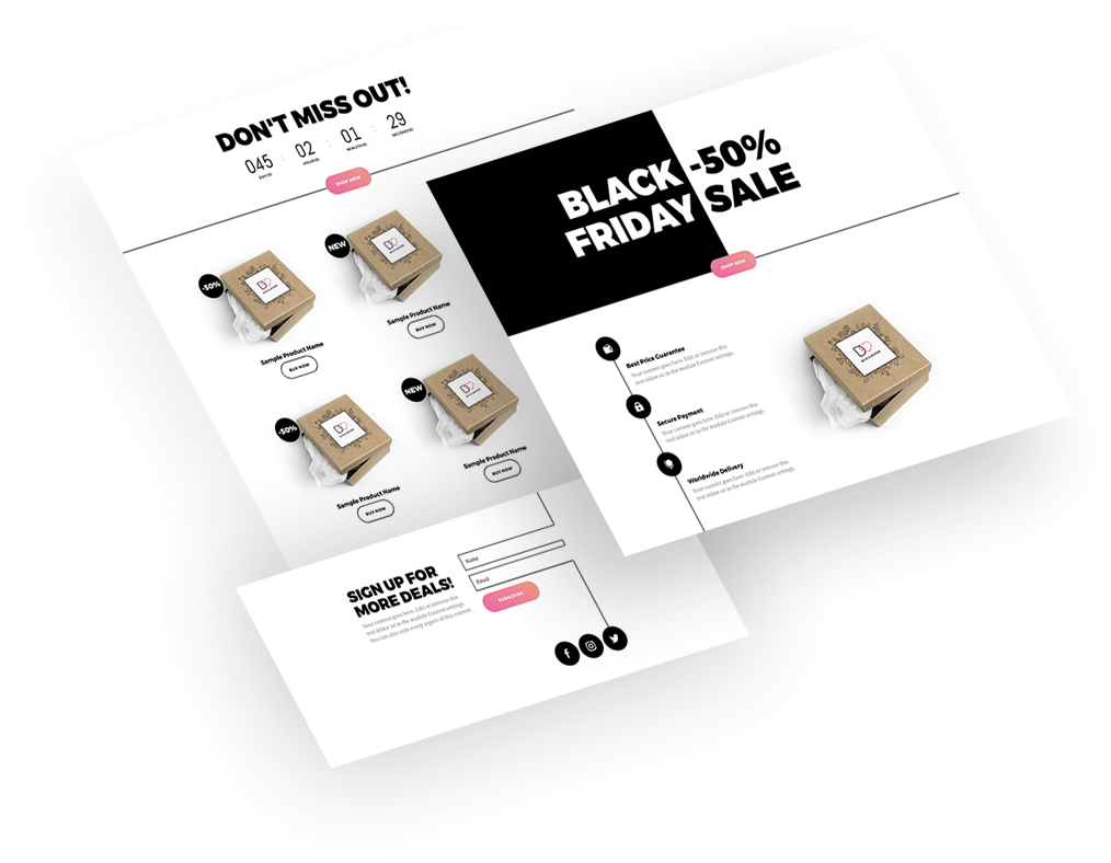
This year is a hard time for sales, and you have put much effort into preparing your Black Friday sales opportunities. What you will certainly need is a simple and functional landing page that will allow you to maximize your income.
And the best part?
Our Black Friday landing page is FREE for our subscribers!
Free Resources for Divi Lovers
Access this layout and dozens of other freebies - available exclusively for newsletter subscribers.
New here?
Join the newsletter to unlock the Freebie Library and get weekly Divi tips, tutorials, and design goodies.
Already subscribed?
Go straight to the Freebie Library and download this layout - plus lots more!
Discover the 5 key features of the new Divi Black Friday Landing Page to find out that it has got all that simple and effective sales process is about.
1. Keep your message simple.
Effective sales translate into a simple buying process for the customer. Effortless and intuitive – these are the keywords. An effective landing page allows an easy customer journey: clear and engaging CTA guides them exactly where they want to go: to a place where their needs are fulfilled. The layout is intuitive, and all the necessary elements are perfectly visible. Focus on a specific offer – don’t give too much choice to ponder on. This will make your message even more appealing.
2. Create a sense of urgency
Tell your customers to get your product right away, no time to lose, or they’ll miss it out. Add a countdown timer counting minutes to the end of the sale.
3. Highlight the benefits
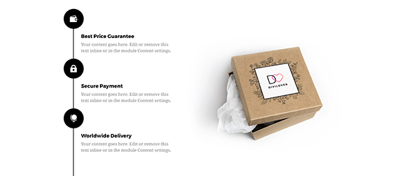
The basic task of your product is to make your customers happy by fulfilling their needs. But there might be more products similar to yours. Your customers must see the benefits not only of the product itself but also of buying them from you. Put them under your customers’ nose, let them know that you are the one who offers fast shipping, free delivery, trouble-free return, or free gift wrapping!
4. Focus on the mobile experience
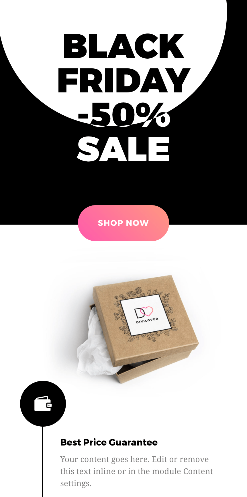
Mobile-friendly design assures that your landing page will be responsive to the growing number of customers that access your website via their smartphones. We kept that in mind designing our Black Friday Landing Page – it compresses and simplifies your info down into a mobile-friendly chunk.
5. Grow your mailing list
You’re well aware that you are creating your landing page also to build an email list of your potential future customers? You can exchange your free or discounted offer for an email address of people that will give you permission to market them. Thanks to our Black Friday landing page, you will easily capture emails of visitors when they click through to indicate they’re interested, giving you more conversions and making it a great sales page. And a great sales page is exactly what you need now!
Final thoughts
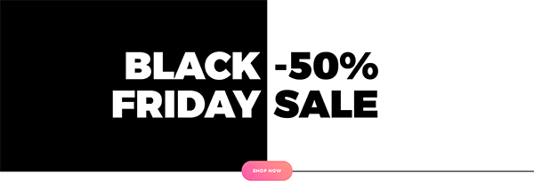
Don’t forget to take a look at the layout demo to see some fun hover effects! If you're interested how we created that Hero Section with monochromatic hover effect, keep an eye on our blog and next CSS and jQuery tutorial!
Heads up for our future Divi freebies and tutorials: sign up to our newsletter so you won’t miss them! If you're our subscriber feel free to download the JSON file now and give yourself a head-start on your Black Friday landing page creation!
We always appreciate your feedback, so let us know in the comments what you think!

Hi, does this still work with DiviVersion: 4.19.0? I just tried hard on all the import places and failed. Does anyone get this template to work?
This layout is out of this world. I saw this layout update on Facebook and I never knew it was out already. I am definitely using it for my cyber Monday sales thanks a million.