Whenever we find ourselves stumped for ideas when designing a new website or child theme, we go looking at the excellent work from other Divi designers. If you’re also in need of some inspiration, here are 12 beautiful websites built with the Divi Theme that we found well executed and worth sharing!
Vibrant and bold
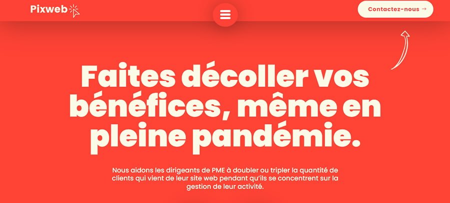
Dynamic, vibrant colors draw the eye, and the hero section with bold typography holds attention. The absolute cherry on top is the header with the hamburger icon menu. Using just the icon and the fullscreen menu allows the CTA button to really stand out in the header.
Elegant
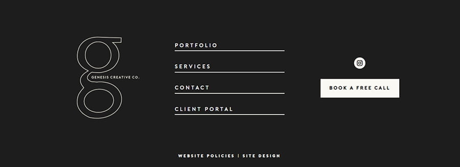
We were enchanted by the muted, understated elegance, slightly broken by the unsymmetrical, overlapping images in the hero section. Button hover effects create a simple yet striking effect. The highlight of this design is the simple, elegant footer.
Boldly accentuated
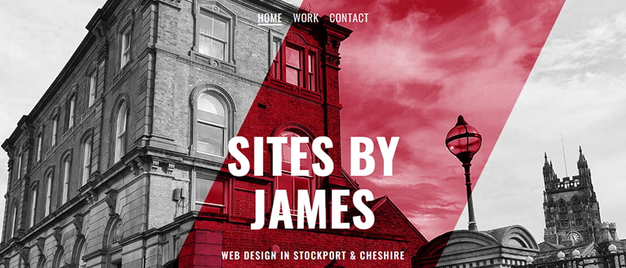
We couldn’t help but admire the bold hero section with attention-grabbing colors. The color palette, with dominating white and gray and an occasional accent color, works very well for a bold and yet elegant effect. Simple menu with underline hover effects complements this look.
Incidentally, if you’d like to achieve a similar menu effect, we’ve done a tutorial with a free layout and copy and paste snippets.
Unique
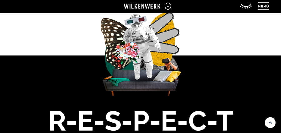
This is one of our quirkier examples. A contrastive black-and-white color scheme is complemented by unique graphic elements. Text is given a prominent role and highlighted in various ways, including the use of a very large font. The header also uses a fullscreen menu. Overall, it’s a modern, unique look that definitely makes this design stand out.
Fresh and simple
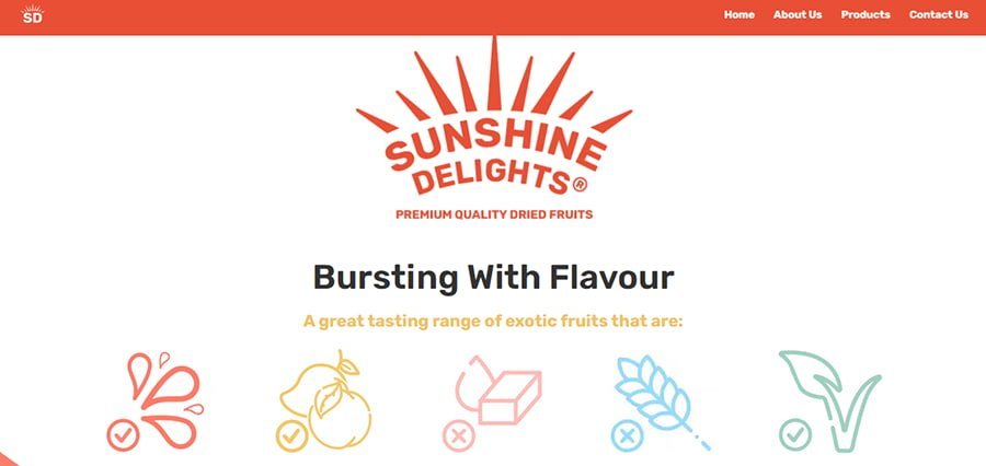
This is a simple website presenting a product, and we were definitely drawn in by the fresh color palette and the use of background and scrolling effects. Very effective and on-brand!
Techy

Here, we specifically noticed the consistent use of the font PT Mono, which creates a very technical, old-fashioned tech vibe. Noteworthy is also the hero section and the slight shift of the text in relation to the background.
Attention-grabbing
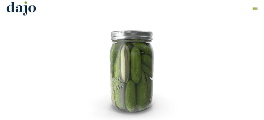
We liked the attention-grabbing use of full width images and text, the scrolling effects, as well as the header with the discreet menu icon.
This is an unusual example of a Divi website, so if you have your doubts whether the theme used truly was Divi, you can check it yourself using the tips from this article: Can you recognize a website built with Divi?
Interactive
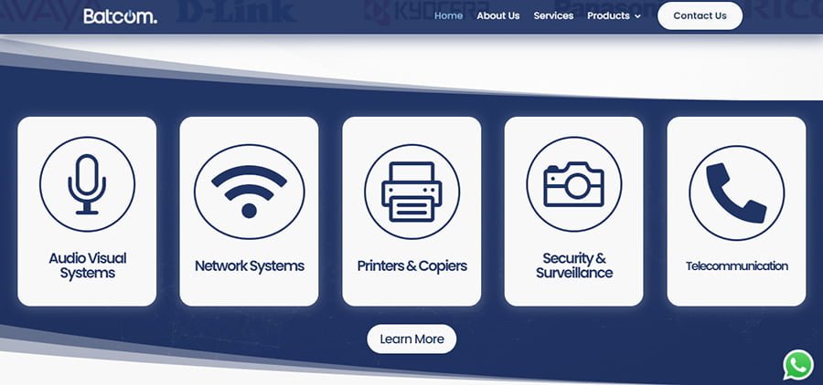
This is Divi at its best: simple and interactive. The flipping blurbs caught our eye, as well as the well-done Divi menu with subtle hover effects.
And if this menu caught your eye and you're wondering how to achieve these hover effects and create this type of mobile menu with custom CSS, you'll be happy to know it was done with the Divi Toolbox plugin, so no coding was involved!
Artistic
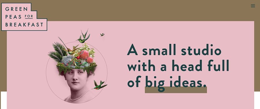
And since we’re talking about stunning and inspiring websites built with the Divi Theme, we have to mention Green Peas for Breakfast! This is a stunning work of art made by Monica, a Divi designer best known for her unique, artistic style. While you’re checking out this amazing website, have a look at her portfolio to see more beautiful web design examples.
Brand-fitting
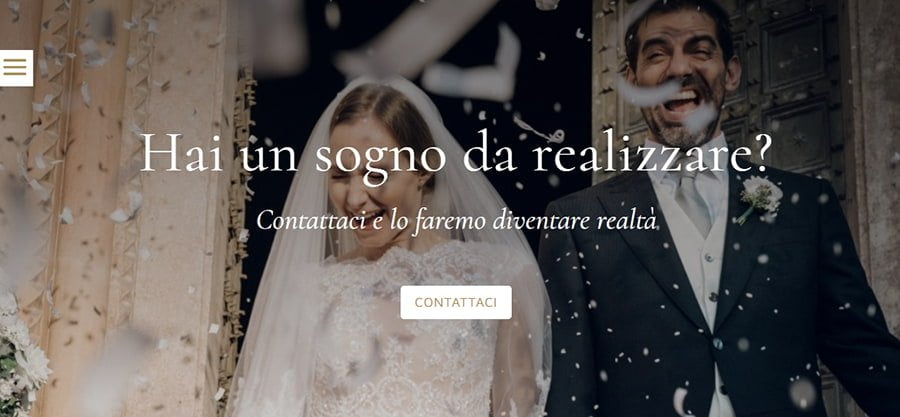
What caught our attention was how much on-brand this website is! For a wedding organization company, it is absolutely on point with the font selections and beautifully displayed stunning photography. The sidebar menu is especially noteworthy, as well as the loading icon.
Cute
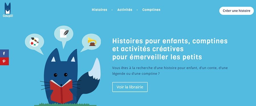
As a website for children, this design boasts simple, consistent colors and cute imagery, as well as subtle hover effects.
Professional
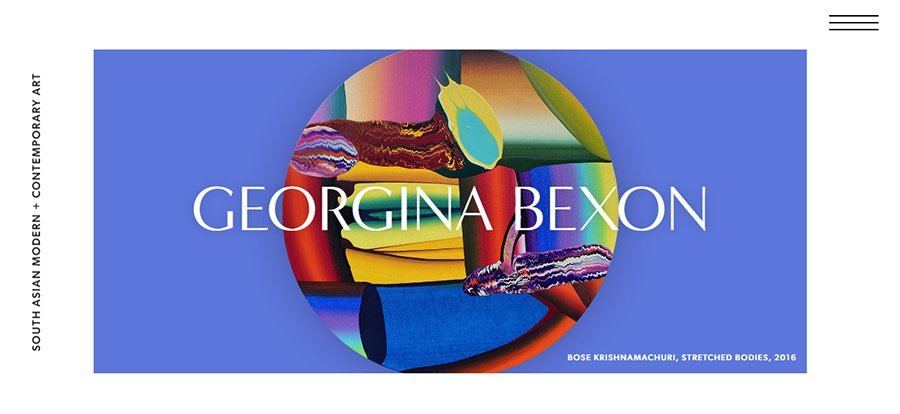
Can Divi be used for a professional art service business? Absolutely! From the use of the Minerva Modern font for headings, through interesting scrolling effects and a clean display of art reproductions, this website fulfills its purpose with excellence.
Beautiful websites built with Divi
So there you have it! These were 12 inspiring, well-designed websites built with the Divi Theme. Which one is your favorite? Or maybe you have another great example which is not on our list? Please, share in the comments!


Thanks for including my website in this list!
Oh, I love the selection! Thanks!
The Green Peas for Breakfast I know before and it is for me still fantastic!!!
Glad you liked it. Yes, that one is amazing!
Thank you for this great website selection. There are so many nice functions on these websites. It would be great if you could show for some how to implement them.
Thank you, Regina! We’ll add your suggestion to the list ☺
Well…
https://georginabexon.com
is my choise as the most stylish.
Good work!
Thank you for your feedback!