CSS clamp() is easily one of my favorite additions to the Divi 5 workflow.
Not because it’s new, but because it finally removes one of the most frustrating parts of responsive design – endless mobile adjustments, breakpoint juggling, and value tweaking that never quite feels right.
With clamp, you define a minimum size, a maximum size, and let the browser smoothly scale everything in between. One value, fluid behavior, far less manual work.
To make this approach easier and more practical in real projects, I created free CSS clamp calculators, designed specifically with Divi 5 designers in mind. In this article, I’ll walk you through what each calculator does and how I use them in real Divi 5 layouts.
TL;DR
CSS clamp lets you create fluid, responsive sizing using a single value instead of multiple breakpoints. In Divi 5, clamp works especially well with presets and global variables. In this article, I share my three versions of CSS clamp calculators – a simple single-value calculator, a typography scale generator, and a spacing scale generator – and explain how I use them in real Divi 5 projects.
Why CSS clamp works so well with Divi 5
Before Divi 5, responsive sizing often meant setting separate values for desktop, tablet, and mobile, then endlessly switching views and fixing edge cases. That approach works, but it’s time-consuming and hard to scale.
CSS clamp changes the model entirely. Instead of thinking in breakpoints, you think in ranges. Your values scale smoothly with the viewport, without abrupt jumps or constant overrides.
Divi 5 makes this even more powerful. With presets and global variables encouraging a more system-based approach, clamp fits naturally into a workflow focused on consistency and reuse rather than constant tweaking.
Simple CSS Clamp Calculator - fast, single-value sizing
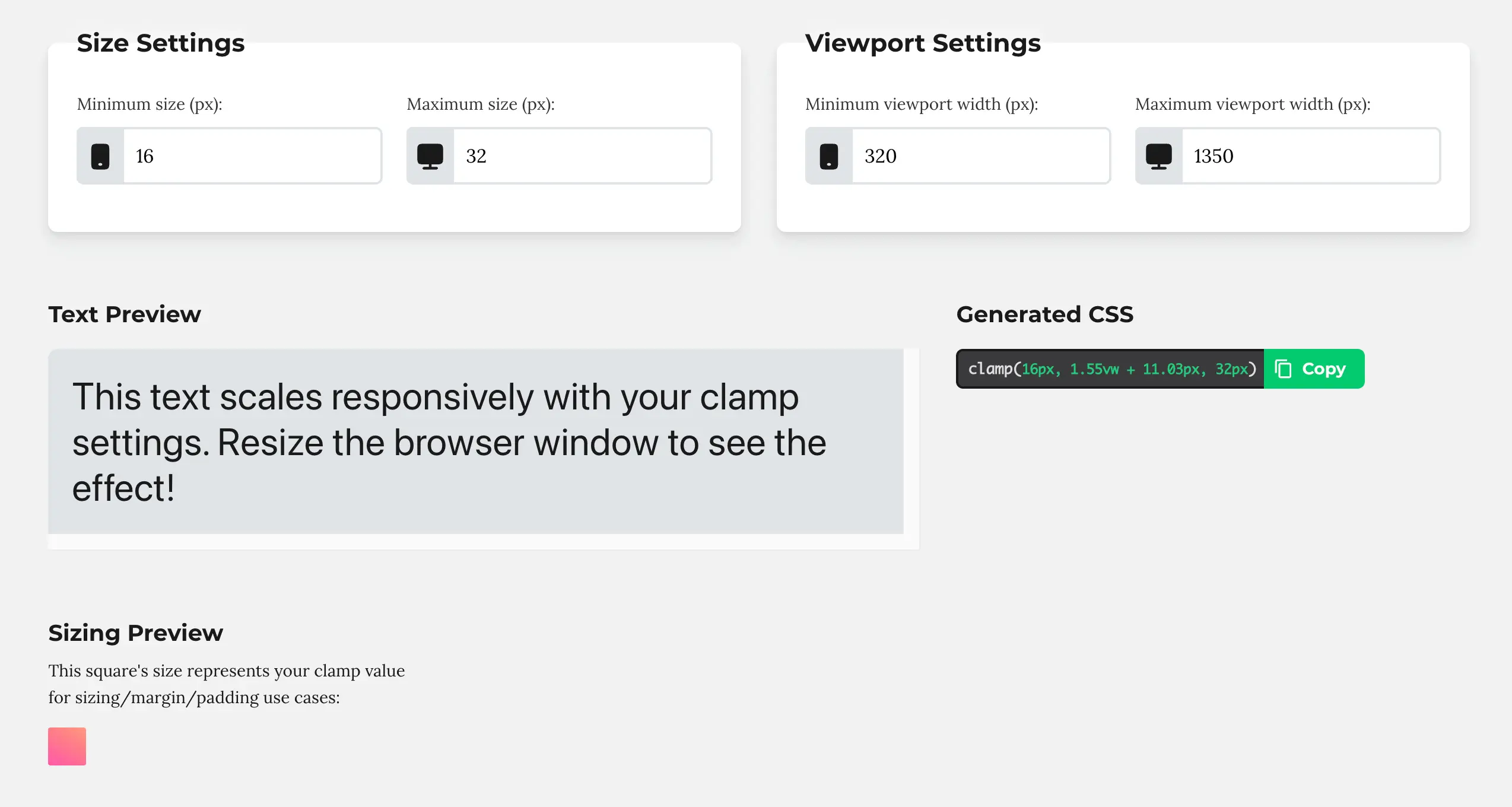
The Simple CSS Clamp Calculator is designed for one thing – speed.
What’s important to understand is that you’re not just setting a minimum and maximum size. You’re also defining the viewport range in which the value should scale.
In practice, this means you’re defining both the size and the range in which it should scale.
You choose the viewport width at which the value should start at its minimum, the viewport width at which it should reach its maximum, and the minimum and maximum size at those points.
Instead of thinking in terms of fixed breakpoints like “mobile, tablet, desktop”, you’re defining a smooth scaling range. The value grows gradually as the viewport changes and stops scaling once it reaches the defined maximum.
This makes clamp extremely predictable. You always know where scaling starts, where it ends, and how the value behaves in between.
I use this calculator whenever I need a quick responsive value without setting up a full scale. If you’re new to clamp, this is the easiest place to start.
Typography Scale Generator - responsive hierarchy without guesswork
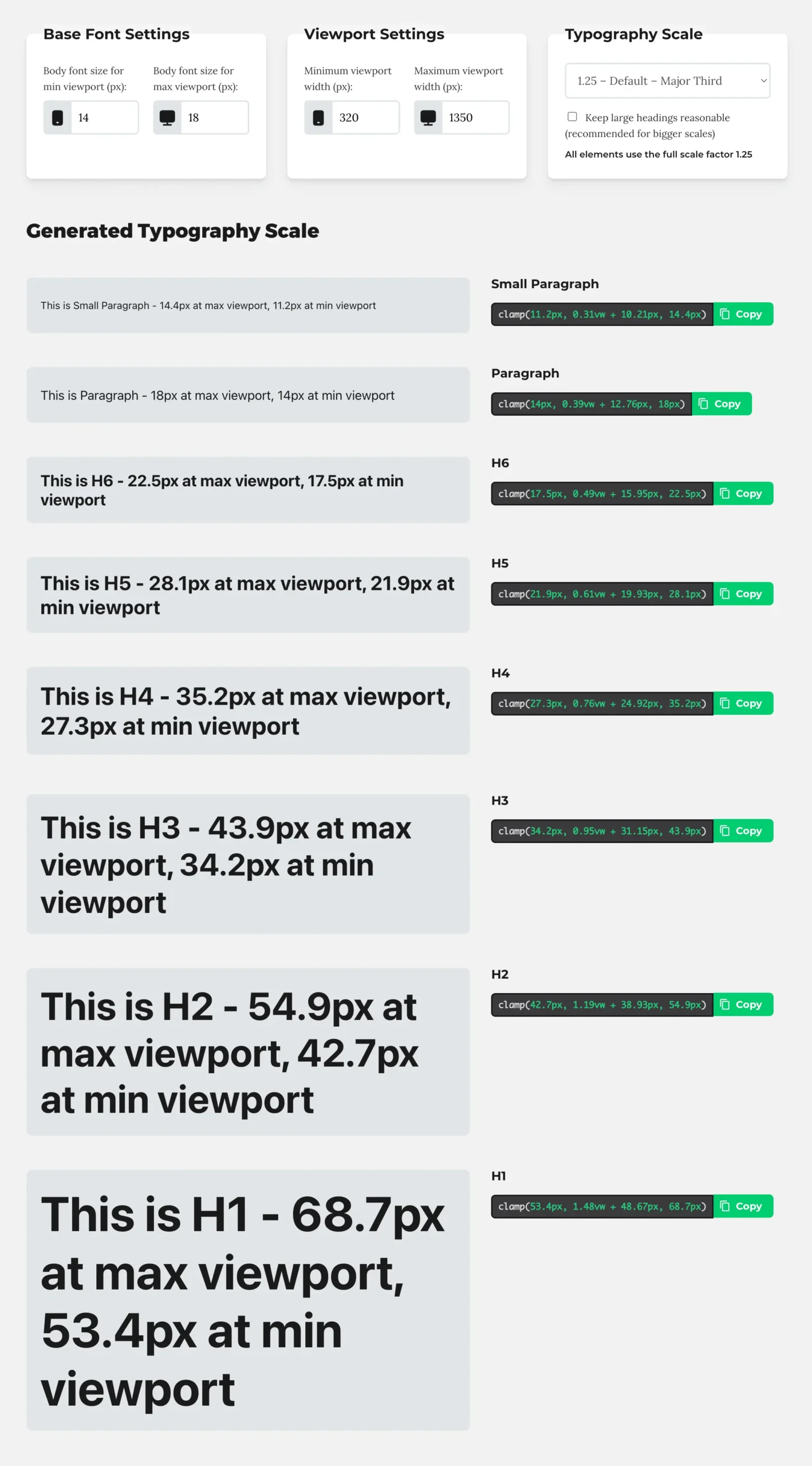
The Typography Scale Generator is where clamp really starts to shine.
Instead of adjusting every heading level separately, this calculator lets you define a base font size for small and large viewports, choose a scale ratio, and generate clamp values for paragraphs and all heading levels at once.
The result is a responsive typography system with a clear hierarchy that scales smoothly across screen sizes. No more wondering whether H3 feels too large on mobile or whether your headings jump too aggressively between breakpoints.
In Divi 5, this works beautifully with presets and global variables. Once the scale is set up, typography becomes predictable, reusable, and easy to maintain across the entire site. This is usually one of the first things I configure when starting a new project.
Spacing Scale Generator - the missing piece in most layouts
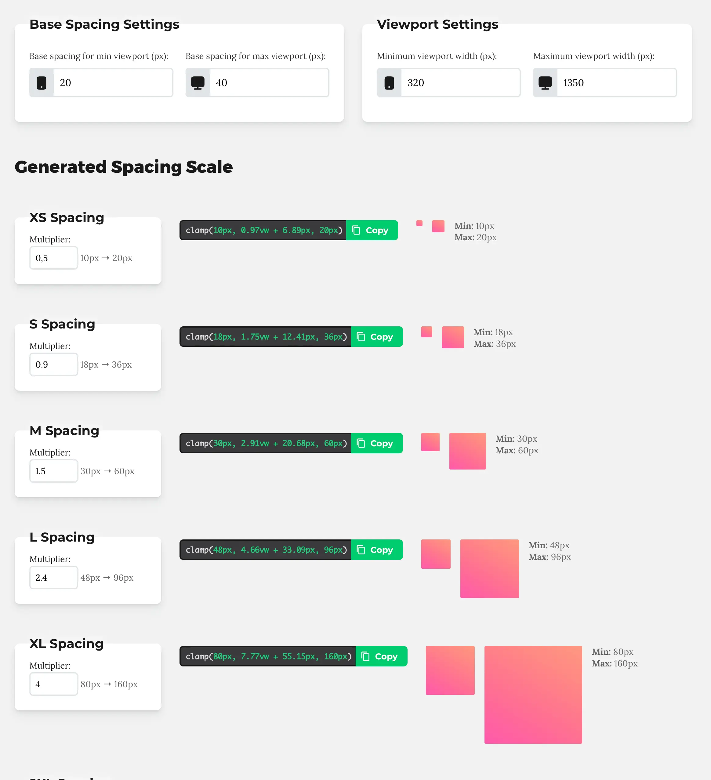
Spacing is often treated as an afterthought, but it has a huge impact on how calm, balanced, and intentional a layout feels.
The Spacing Scale Generator applies the same system-based thinking to margins, padding, and gaps. You define a base spacing size and a scale, and the calculator generates fluid clamp values that scale naturally with the viewport.
I use this primarily for section padding, row spacing, and vertical rhythm across layouts. Instead of manually adjusting spacing per breakpoint, the layout breathes naturally as the screen size changes.
Once you experience this in practice, it becomes very hard to go back to fixed spacing values.
How I use these calculators in real Divi 5 projects
In most projects, I use all three calculators together.
The typography scale defines the overall text hierarchy. The spacing scale creates consistent layout rhythm. The simple clamp calculator handles individual exceptions where I need quick, targeted adjustments.
Clamp takes care of responsive sizing. A design system takes care of consistency and decisions. Together, they dramatically reduce the amount of responsive cleanup needed later and make layouts far easier to manage as a site grows.
If you want to see how clamp fits into a complete, system-based workflow in Divi 5 – including typography, spacing, and layout decisions – you may also want to explore my Design System Mini Course.
FAQ
What is CSS clamp and when should I use it in Divi 5?
CSS clamp allows you to define a fluid value that scales between a minimum and maximum size based on the viewport width. In Divi 5, it’s especially useful for font sizes and spacing because it reduces the need for multiple breakpoint-specific values.
Do I still need breakpoints if I use clamp in Divi?
Yes, but far less often. Clamp handles most responsive sizing automatically, while breakpoints are still useful for layout changes or specific edge cases.
Where should I use clamp values in Divi 5?
Clamp works best for font sizes, spacing values, and any design element that should scale smoothly across screen sizes. It pairs particularly well with presets and global variables.
Is CSS clamp only for advanced users?
Not at all. With the help of calculators, clamp becomes accessible even for beginners. You don’t need to understand the math behind it to use it effectively in real projects.


Hi Ania,
Do you use thos for padding, margin and all spacing methods?
Will it be mobile responsive in this case.
Where other settings can it use, as it can shorten a lot work on pages?
When will you have some time, for great videos again? Divi 5 now released officialky and there are a lot of changes.
Thaks for your great job you did with Divi!
Cheers,
WebServe
Very well put together material. It accurately points out why the logic of clamp() fits in with Divi 5’s preset and global variable-based approach.
It’s especially valuable that you present not only the theory, but also a useful, systematic workflow (typography + spacing + unique exceptions). This approach really reduces breakpoint-level post-processing and results in projects that are much more maintainable in the long run.
(It’s great that Divi 5 is finally here with these great changes. – I hope you’ll have time for lots of Divi 5 articles/topics 🙂 )
Thanks, Ania