New year, new projects, new trends! Like any other form of art, web design keeps evolving, sometimes moving in unexpected and thrilling directions, sometimes digging up old ideas and giving them a breath of new life. If you need inspiration for trying something interesting this year, we’ve compiled a list of some fabulous web design trends we’ve seen crop up recently.
Minimalism
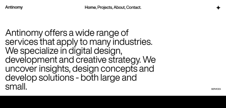
Of course, this is nothing new: minimalism has been a leading style in web design for quite some time, and it is here to stay. Clean, uncluttered, simple websites with plentiful white space and very simple (even black-and-white) color schemes convey professionalism and are easy to read and navigate. But there are various ways in which this trend is carried out. The effect of simplicity and space can be achieved by putting a focus on just one type of element: an image with minimal text, or just text in a simple sans-serif font, standing on its own.
Bold type
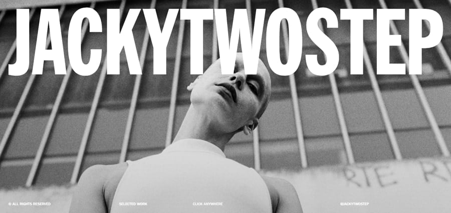
We’ve been seeing more and more excellent designs where simple text is front and center, and often larger than life. Written in all caps, in a simple sans-serif font, the bold, angular text dominates the design. A brand name presented like this creates a strong, bold statement. It is also an extension of the minimalism trend, because when you create such a strong accent, you can’t break this effect by adding too many attention-grabbing elements.
Immersion
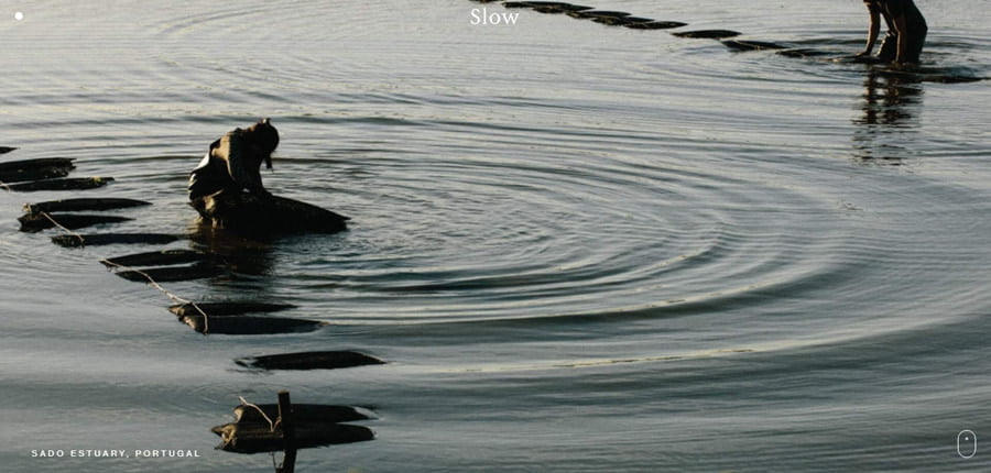
It’s 2022, and the pandemic is still here. With many countries in lockdown, it is no surprise that we rely more and more on the Web to provide us with experiences and emotions. Websites that offer this immersive experience are especially engaging. One way to achieve this immersion-type design is to create a cinematography-style website, where the full screen is filled with an evocative, beautiful photograph, video, or animation. The image engages the senses instantly and creates an emotion. This trend should be especially useful for any website which sells products or experiences.
Paper on page
This is another example of the real world moving into Web spaces. In this trend, we see designers draw inspiration from physical paper mediums, such as newspapers or bullet journals. Bullet journal aesthetic is a growing trend of its own, so it’s not surprising designers incorporate the elements of this aesthetic into their designs.

Retro
Retro used to mean really old styles, like Art Nouveau, the Roaring Twenties, or even the 50s and the Pin-up style. Well, now the term “retro” can be also applied to the 90s, and even the 2000s! Feel old yet? So, when we now see the bold colors of the 90s fashion in web design, it is an example of a retro style.

The trends combined
You might have noticed that in the examples we used, many of these trends were overlapping. They can be used together to very striking outcomes!
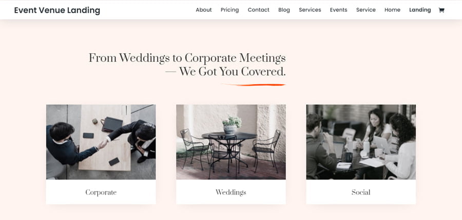
Here is an interesting layout that connects many of these elements. It’s minimalist, with muted colors and one accent color. The sepia images combined with the elegant Prata serif font create a nostalgic, retro effect, and the orange accents mimic handwritten notes.
Final thoughts
It is always inspiring to take a look at new design ideas being shared on aggregator sites. Some are incredibly simple and easy to execute, and at the same time, powerful and influential. And some might definitely require more advanced skills, so if you’re looking for a way to level up your game and learn custom CSS, we have a comprehensive free guide that will teach you all you need to know.
We hope this post gave you some inspiration today! What is your favorite new (or new-old) web design trend?

Hi – I agree with your comment about the immersive aspect of the ‘Slowness’ website you refer to above – I am looking to find a way to be able to create a similar feel to a website soon – my question is – do you know how to produce a menu like they are using and do you know how to trigger the menu links on hover (as in the website) to show images connected to the link in the ‘other’ half of the page?
wrapper {
-ms-overflow-style: none; // IE 10+
overflow: -moz-scrollbars-none; // Firefox
}
wrapper::-webkit-scrollbar {
display: none; // Safari and Chrome
}
Hi Roshan – I am not sure what you are suggesting?
“Custom JavaScript” would be a short answer, Michael. With jQuery you’d be looking at the .hover() event. I’m sorry, I won’t be able to give you an exact answer in the comments here. I might do a tutorial with a similar effect in the future (I’ll add it to my to-do list) 😉
Thank you Ania – I do find some of the more seductive capabilities out there absent from Divi ( I am not suggesting Divi can’t produce seductive websites) It would be great if you were to produce a tutorial on it – it’s always good to learn of how to get effects that Divi is absent of. Many thanks
Nice little break down and I’m especially liking the paper on page look