Updated for Divi 5: The CSS and jQuery from this tutorial still work in Divi 5, because the Menu module keeps its Divi 4 class names. I tested them on Divi 5.18 (desktop clicks and phone taps) and added one line, text-align: left, because the Divi 5 Menu module aligns its text to the right on tablets and phones by default.
How to create a vertical menu with collapsible submenus in Divi
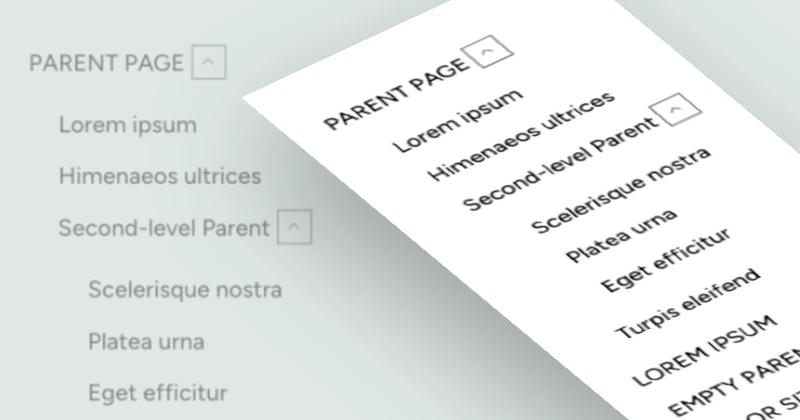
Add a CSS class to a standard Divi Menu module, paste a short CSS snippet that turns the menu into a vertical list (on every screen size) and hides the sub-menus, then add a few lines of jQuery that insert an arrow next to each parent item. A click on the arrow slides its sub-menu open or closed.
In this Divi tutorial, we’re going to learn how to customize the Divi Menu Module to turn it vertical, to add collapsible submenus, and to keep the menu visible on any screen size. This layout will be super helpful for footers and sidebars, for example. This could be accomplished using a Text Module, but using a Menu module gives us a few advantages: for example, if we use plugins to enhance our Menu modules, this module will be positively affected as well.
We already have one tutorial on creating a vertical menu in Divi, but in this tutorial, we’ll focus on adding collapsible submenus. We’ll be using custom CSS and jQuery.
You can watch the video for a step-by-step explanation (it’s a replay of a live session from my Divi Stylist Community), read the article and copy the code, or do a combination of both. I hope you have fun and find the steps easy to follow!
The video was recorded in Divi 4. The CSS and jQuery are the same in Divi 5; only the place where you add the CSS class moved (see Step 1), and the CSS below has the extra text-align: left line.
Heads up! If you don't feel up to coding with CSS and jQuery or just want a quick solution to get a beautiful vertical menu for Divi, you can download this free layout! It contains four vertical menu options, and you can use them for any project, personal or commercial, for free. See them on the demo page.
Free download
Vertical Menus with Collapsible Submenus Layout
Four styles of a vertical Divi Menu module with collapsible sub-menus that open on click, with the CSS and jQuery included. Works in Divi 5 and Divi 4.
Get the free downloadStep 1: Create a Menu module with a CSS class
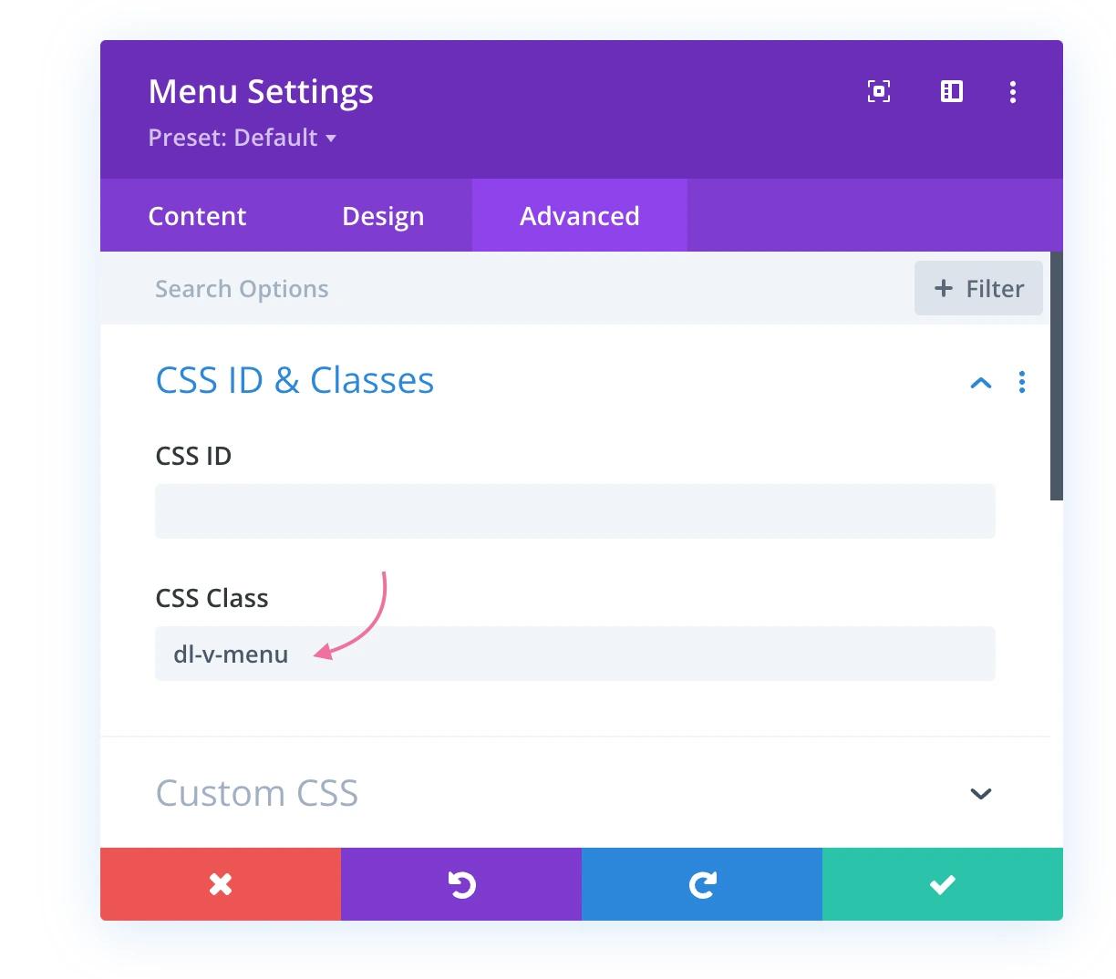
Add a standard Divi Menu module, select your menu in Content → Menu, and give the module the CSS class dl-v-menu. In Divi 5 the class goes in Advanced → Attributes → Add Attribute → CSS Class (in Divi 4: Advanced → CSS ID & Classes).
We'll be using a standard Divi Menu module for our navigation. The class is what the CSS and the jQuery look for, so only the menus with this class turn vertical, and your header menu stays as it is.
Tip: if a parent item doesn't need its own page, add it in Appearance → Menus as a Custom Link with the URL #. With the jQuery from Step 3, a click on that link opens its sub-menu too.
Step 2: Add the CSS snippet
The CSS shows the menu links as a vertical list on every screen width, hides the hamburger version, and turns the dropdowns into regular, hidden lists that sit inside the menu (instead of floating over the content). Because the sub-menus are hidden with display: none, Divi's own hover dropdown no longer opens them: only the toggle does.
Place the CSS code in your Theme Options (Divi → Theme Options → General → Custom CSS) or child theme stylesheet. You can also paste it into a Code module on the page, wrapped in <style> tags.
.dl-v-menu.et_pb_menu .et_pb_menu_inner_container,
.dl-v-menu.et_pb_menu .et_pb_menu__wrap,
.dl-v-menu.et_pb_menu .et_pb_menu__menu,
.dl-v-menu.et_pb_menu .et_pb_menu__menu>nav,
.dl-v-menu.et_pb_menu .et_pb_menu__menu>nav>ul {
    display: block;
}

.dl-v-menu.et_pb_menu .et_mobile_nav_menu {
    display: none;
}

#page-container .dl-v-menu ul.sub-menu {
    position: relative;
    visibility: visible;
    opacity: 1;
    top: 0;
    left: 0;
    width: auto;
    border-top: none;
    box-shadow: none;
    display:none;
    transition: none;
}

#page-container .dl-v-menu ul.sub-menu a {
    text-transform: none;
    background:none;
}

#page-container .dl-v-menu li {
    display: block;
    width: fit-content;
    text-align: left;
}

#page-container .dl-v-menu li a {
    width:fit-content;
    display: inline-block;
}

.dl-v-menu .menu-item-has-children>a:first-child:after {
    display: none;
}

span.dl-sub-toggle {
    font-family: 'ETmodules';
    display: inline-block;
    line-height: 18px;
    text-align: center;
    width: 20px;
    height: 20px;
    border: 1px solid #666;
    transform: scale(1.2);
    transition: .3s ease;
    cursor:pointer;
}

.toggled > span.dl-sub-toggle {
    transform: scale(1.2) rotate(180deg);
}
What changed for Divi 5: the first two rules start with .dl-v-menu.et_pb_menu, so they always win over Divi's own rule that hides the menu links at 980px and below (no matter which CSS loads first), and the menu items got text-align: left. Without it, a parent link on a phone jumps to the right when its sub-menu opens, because the Divi 5 Menu module aligns text to the right on tablets and phones. The same CSS works in Divi 4.
Step 3: Add the jQuery code
The jQuery adds a small arrow button before every sub-menu and opens or closes the sub-menu with a slide when you click (or tap) the arrow. The script can be placed inside a Code module directly on your page, or (if it's a functionality you'd like to use globally in various places on your website) in Divi → Theme Options → Integration, in the "Add code to the < body >" field.
<script>
jQuery(document).ready(function($) {

	$('.dl-v-menu ul.sub-menu').before('<span class="dl-sub-toggle">3</span>');
	$('.dl-v-menu .menu-item-has-children').off('touchend');
	$(document).on('touchend click', '.dl-sub-toggle, .dl-v-menu li.menu-item-has-children > a[href="#"] ', function(e){
		e.preventDefault();
		$(this).siblings('ul').slideToggle();
		$(this).parent().toggleClass('toggled');
	});

});
</script>
How the jQuery works
$('.dl-v-menu ul.sub-menu').before(…)adds aspan.dl-sub-togglebefore every sub-menu. Its content, the number 3, is the "arrow down" icon of Divi's icon font (ETmodules), which the CSS sets as the span's font..off('touchend')removes Divi's own touch handler from the parent items, which would otherwise treat the first tap as "show the dropdown" and the second tap as "open the link".- The click and touch handler toggles the sub-menu with
slideToggle()and adds the classtoggledto the parent item. The CSS uses that class to rotate the arrow by 180 degrees. - Parent links with the URL
#trigger the same toggle (andpreventDefault()stops them from jumping to the top of the page).
In Divi 5, an inline script like this one works in a Code module even though Divi loads jQuery at the end of the page: Divi collects jQuery(document).ready() calls made before jQuery is loaded and runs them as soon as it is. I tested the code exactly as above on Divi 5.18.
Does Divi 5 have collapsible sub-menus built in?
Only for the mobile (hamburger) menu. The Divi 5 Menu module has a Collapsible Mobile Menu option in its Design tab: when you turn it on, parent items in the mobile dropdown get an expand/collapse control, and you can pick the open and close icons and their colors.
It doesn't change the desktop menu, though, and the menu still turns into a hamburger icon on smaller screens. If you want a menu that is always visible as a vertical list (like in a footer or a sidebar) with sub-menus that open on click on every device, the CSS and jQuery from this tutorial are still the way to go.
How to style the sub-menus and the arrow
Change the look of the arrow in the span.dl-sub-toggle rule, and the sub-menus with the Menu module's own settings (Design tab) or a little extra CSS.
- Arrow border: change
border: 1px solid #666, or replace it with a background, for examplebackground: #000; color: #fff; border-radius: 3px;. - Arrow size: the arrow is 20 × 20px and scaled with
transform: scale(1.2). Change the scale in both rules (the normal one and the.toggled > span.dl-sub-toggleone). - Sub-menu indent: Divi indents sub-menu items with its own padding. Add
padding-leftto#page-container .dl-v-menu ul.sub-menuto change it. - Colors: menu link color, active link color and the dropdown background are regular Menu module settings, in Divi 5 and Divi 4.
If you'd like four ready-made styles (with filled arrows, link backgrounds, borders or numbered items), grab the free vertical menu layout.
That's how you add vertical sub-menus to a Menu module in the Divi Builder!
Here's the demo page with four Menu modules that use the code shared in this tutorial, each styled a little differently.
I hope you found this tutorial helpful and easy to understand. If you have questions, want advice or clarification, or want to show me your vertical menu, hit me up in my Divi Lovers Facebook group.