Updated for Divi 5: Divi 5 positions the button icon (the button's ::before and ::after elements) differently than Divi 4, so the original snippets broke after the update. All 25 effects and the free layout have been rewritten, and they now work in Divi 5 and still work in Divi 4.
Want to put a fun spin on your Divi buttons?
The Divi Button module has a plethora of customization options. You can change the color, icon, hover style, animation, position… But what if you want to go above and beyond what Divi offers?
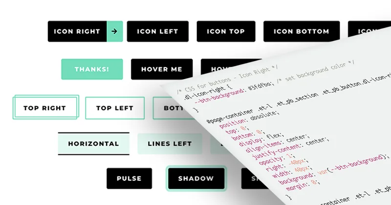
This is where this Divi button tutorial comes in. You can choose from 25 button hover effects, all available as easy copy-and-paste snippets! All you need to do is copy and paste the code, and follow my instructions to easily turn any of these button styles into a preset.
Having trouble choosing just one effect? Grab the free layout so you can have all of these styles in one place. And if you're a CSS beginner who would like to understand the code and tweak it, feel free to check out our Ultimate Guide for Working with CSS in Divi.
See a live preview of all 25 effects here.
The video was recorded in Divi 4. The steps are the same in Divi 5, just use the updated code from this post.
How to use these snippets
Each effect is one CSS class. Copy the snippet into Divi → Theme Options → Custom CSS (or your child theme's style.css), then add the class to a Button module. In Divi 5 go to Advanced → Attributes → Add Attribute → CSS Class; in Divi 4 it's Advanced → CSS ID & Classes.
Colors and border widths are CSS variables at the top of each snippet, so you can change them without touching the rest of the code. To reuse a style on many buttons, add the class to a Button preset: every button that uses the preset gets the effect.
Free download
Divi Buttons CSS Snippets Layout
A Divi 5 page with all 25 button hover effects from the tutorial, each with its CSS in a Code module. Import it and copy the effects you like.
Get the free download1. Fun with icons
These effects show the button icon on a colored panel, so make sure the icon is turned on in the Button module settings.
Icon right

Use the CSS class dl-icon-right. Make sure to adjust the button padding on hover to leave space for the icon.
/* CSS for buttons - Icon Right */
.dl-icon-right {
  --btn-background: #3fdfba; /* set background color */
}

#page-container .et-l .et_pb_section .et_pb_button.dl-icon-right {
  overflow: hidden;
}

#page-container .et-l .et_pb_section .et_pb_button.dl-icon-right::after {
  display: flex !important;
  align-items: center;
  justify-content: center;
  inset: 0 0 0 auto;
  margin: 0 !important;
  transform: none;
  opacity: 1;
  width: 40px;
  background: var(--btn-background);
  translate: 100% 0;
  transition: translate .3s ease;
}

#page-container .et-l .et_pb_section .et_pb_button.dl-icon-right:hover::after {
  translate: 0 0;
}
Icon left

Use the CSS class dl-icon-left. Make sure to adjust the button padding on hover to leave space for the icon. Set the icon placement to Left.
/* CSS for buttons - Icon Left */
.dl-icon-left {
  --btn-background: #3fdfba; /* set background color */
}

#page-container .et-l .et_pb_section .et_pb_button.dl-icon-left {
  overflow: hidden;
}

#page-container .et-l .et_pb_section .et_pb_button.dl-icon-left::before {
  display: flex !important;
  align-items: center;
  justify-content: center;
  inset: 0 auto 0 0;
  margin: 0 !important;
  transform: none;
  opacity: 1;
  width: 40px;
  background: var(--btn-background);
  translate: -100% 0;
  transition: translate .3s ease;
}

#page-container .et-l .et_pb_section .et_pb_button.dl-icon-left:hover::before {
  translate: 0 0;
}
Icon fade in

Use the CSS class dl-icon-fade. Adjust the icon font-size if needed.
/* CSS for buttons - Icon Animation - Fade In */
.dl-icon-fade {
  --btn-background: #3fdfba; /* set background color */
}

#page-container .et-l .et_pb_section .et_pb_button.dl-icon-fade {
  overflow: hidden;
}

#page-container .et-l .et_pb_section .et_pb_button.dl-icon-fade::after {
  display: flex !important;
  align-items: center;
  justify-content: center;
  inset: 0;
  margin: 0 !important;
  transform: none;
  opacity: 0;
  font-size: 2em !important;
  background: var(--btn-background);
  transition: opacity .3s ease;
}

#page-container .et-l .et_pb_section .et_pb_button.dl-icon-fade:hover::after {
  opacity: 1;
}
Icon from the top

Use the CSS class dl-icon-top. Adjust the icon font-size if needed.
/* CSS for buttons - Icon Top */
.dl-icon-top {
  --btn-background: #3fdfba; /* set background color */
}

#page-container .et-l .et_pb_section .et_pb_button.dl-icon-top {
  overflow: hidden;
}

#page-container .et-l .et_pb_section .et_pb_button.dl-icon-top::after {
  display: flex !important;
  align-items: center;
  justify-content: center;
  inset: 0;
  margin: 0 !important;
  transform: none;
  opacity: 1;
  font-size: 2em !important;
  background: var(--btn-background);
  translate: 0 -100%;
  transition: translate .3s ease;
}

#page-container .et-l .et_pb_section .et_pb_button.dl-icon-top:hover::after {
  translate: 0 0;
}
Icon from the bottom

Use the CSS class dl-icon-bottom. Adjust the icon font-size if needed.
/* CSS for buttons - Icon Bottom */
.dl-icon-bottom {
  --btn-background: #3fdfba; /* set background color */
}

#page-container .et-l .et_pb_section .et_pb_button.dl-icon-bottom {
  overflow: hidden;
}

#page-container .et-l .et_pb_section .et_pb_button.dl-icon-bottom::after {
  display: flex !important;
  align-items: center;
  justify-content: center;
  inset: 0;
  margin: 0 !important;
  transform: none;
  opacity: 1;
  font-size: 2em !important;
  background: var(--btn-background);
  translate: 0 100%;
  transition: translate .3s ease;
}

#page-container .et-l .et_pb_section .et_pb_button.dl-icon-bottom:hover::after {
  translate: 0 0;
}
2. Text on hover
Text fade in

Use the CSS class dl-hover-text-fade. Adjust the right and left padding to make space for longer text if needed. Add content: 'My text'; to the After field in the Button module settings (Divi 5: Advanced → CSS → Module Elements → After; Divi 4: Advanced → Custom CSS → After). The background color on hover is set in the module settings.
/* CSS for buttons - Text on hover - Fade In
   Set the text in the Button module's After field, e.g. content: "Thanks!";
   (Divi 5: Advanced → CSS → Module Elements → After; Divi 4: Advanced → Custom CSS → After) */
#page-container .et-l .et_pb_section .et_pb_button.dl-hover-text-fade {
  overflow: hidden;
}

#page-container .et-l .et_pb_section .et_pb_button.dl-hover-text-fade::after {
  display: flex !important;
  align-items: center;
  justify-content: center;
  inset: 0;
  margin: 0 !important;
  transform: none;
  font-family: inherit !important;
  font-size: inherit !important;
  font-weight: inherit !important;
  line-height: inherit !important;
  letter-spacing: inherit;
  text-transform: inherit;
  opacity: 0;
  background: inherit;
  transition: opacity .3s linear;
}

#page-container .et-l .et_pb_section .et_pb_button.dl-hover-text-fade:hover::after {
  opacity: 1;
}
Text from the left

Use the CSS class dl-hover-text-left. Adjust the right and left padding to make space for longer text if needed. Add content: 'My text'; to the After field in the Button module settings (Divi 5: Advanced → CSS → Module Elements → After; Divi 4: Advanced → Custom CSS → After).
/* CSS for buttons - Text on hover - Slide from the Left
   Set the text in the Button module's After field, e.g. content: "Thanks!";
   (Divi 5: Advanced → CSS → Module Elements → After; Divi 4: Advanced → Custom CSS → After) */
.dl-hover-text-left {
  --btn-background: #3fdfba; /* set background color */
}

#page-container .et-l .et_pb_section .et_pb_button.dl-hover-text-left {
  overflow: hidden;
}

#page-container .et-l .et_pb_section .et_pb_button.dl-hover-text-left::after {
  display: flex !important;
  align-items: center;
  justify-content: center;
  inset: 0;
  margin: 0 !important;
  transform: none;
  font-family: inherit !important;
  font-size: inherit !important;
  font-weight: inherit !important;
  line-height: inherit !important;
  letter-spacing: inherit;
  text-transform: inherit;
  opacity: 1;
  background: var(--btn-background);
  translate: -100% 0;
  transition: translate .3s ease;
}

#page-container .et-l .et_pb_section .et_pb_button.dl-hover-text-left:hover::after {
  translate: 0 0;
}
Text from the right

Use the CSS class dl-hover-text-right. Adjust the right and left padding to make space for longer text if needed. Add content: 'My text'; to the After field in the Button module settings (Divi 5: Advanced → CSS → Module Elements → After; Divi 4: Advanced → Custom CSS → After).
/* CSS for buttons - Text on hover - Slide from the Right
   Set the text in the Button module's After field, e.g. content: "Thanks!";
   (Divi 5: Advanced → CSS → Module Elements → After; Divi 4: Advanced → Custom CSS → After) */
.dl-hover-text-right {
  --btn-background: #3fdfba; /* set background color */
}

#page-container .et-l .et_pb_section .et_pb_button.dl-hover-text-right {
  overflow: hidden;
}

#page-container .et-l .et_pb_section .et_pb_button.dl-hover-text-right::after {
  display: flex !important;
  align-items: center;
  justify-content: center;
  inset: 0;
  margin: 0 !important;
  transform: none;
  font-family: inherit !important;
  font-size: inherit !important;
  font-weight: inherit !important;
  line-height: inherit !important;
  letter-spacing: inherit;
  text-transform: inherit;
  opacity: 1;
  background: var(--btn-background);
  translate: 100% 0;
  transition: translate .3s ease;
}

#page-container .et-l .et_pb_section .et_pb_button.dl-hover-text-right:hover::after {
  translate: 0 0;
}
Text from the top

Use the CSS class dl-hover-text-top. Adjust the right and left padding to make space for longer text if needed. Add content: 'My text'; to the After field in the Button module settings (Divi 5: Advanced → CSS → Module Elements → After; Divi 4: Advanced → Custom CSS → After).
/* CSS for buttons - Text on hover - Slide from the Top
   Set the text in the Button module's After field, e.g. content: "Thanks!";
   (Divi 5: Advanced → CSS → Module Elements → After; Divi 4: Advanced → Custom CSS → After) */
.dl-hover-text-top {
  --btn-background: #3fdfba; /* set background color */
}

#page-container .et-l .et_pb_section .et_pb_button.dl-hover-text-top {
  overflow: hidden;
}

#page-container .et-l .et_pb_section .et_pb_button.dl-hover-text-top::after {
  display: flex !important;
  align-items: center;
  justify-content: center;
  inset: 0;
  margin: 0 !important;
  transform: none;
  font-family: inherit !important;
  font-size: inherit !important;
  font-weight: inherit !important;
  line-height: inherit !important;
  letter-spacing: inherit;
  text-transform: inherit;
  opacity: 1;
  background: var(--btn-background);
  translate: 0 -100%;
  transition: translate .3s ease;
}

#page-container .et-l .et_pb_section .et_pb_button.dl-hover-text-top:hover::after {
  translate: 0 0;
}
Text from the bottom

Use the CSS class dl-hover-text-bottom. Adjust the right and left padding to make space for longer text if needed. Add content: 'My text'; to the After field in the Button module settings (Divi 5: Advanced → CSS → Module Elements → After; Divi 4: Advanced → Custom CSS → After).
/* CSS for buttons - Text on hover - Slide from the Bottom
   Set the text in the Button module's After field, e.g. content: "Thanks!";
   (Divi 5: Advanced → CSS → Module Elements → After; Divi 4: Advanced → Custom CSS → After) */
.dl-hover-text-bottom {
  --btn-background: #3fdfba; /* set background color */
}

#page-container .et-l .et_pb_section .et_pb_button.dl-hover-text-bottom {
  overflow: hidden;
}

#page-container .et-l .et_pb_section .et_pb_button.dl-hover-text-bottom::after {
  display: flex !important;
  align-items: center;
  justify-content: center;
  inset: 0;
  margin: 0 !important;
  transform: none;
  font-family: inherit !important;
  font-size: inherit !important;
  font-weight: inherit !important;
  line-height: inherit !important;
  letter-spacing: inherit;
  text-transform: inherit;
  opacity: 1;
  background: var(--btn-background);
  translate: 0 100%;
  transition: translate .3s ease;
}

#page-container .et-l .et_pb_section .et_pb_button.dl-hover-text-bottom:hover::after {
  translate: 0 0;
}
3. Double borders
Top & right

Use the CSS class dl-double-border-top-right. Set the same border width in the CSS code as the border width in the Button module settings.
/* CSS for buttons - Double border on hover - Top & Right */
.dl-double-border-top-right {
  --border-width: 2px; /* set the Button border width */
}

#page-container .et-l .et_pb_section .et_pb_button.dl-double-border-top-right::after {
  content: '' !important;
  display: block !important;
  inset: calc(var(--border-width) * -1);
  margin: 0 !important;
  transform: none;
  opacity: 1;
  border: inherit;
  border-radius: inherit;
  background: none;
  z-index: -1;
  transition: translate .3s ease, inset .3s ease;
}

#page-container .et-l .et_pb_section .et_pb_button.dl-double-border-top-right:hover::after {
  translate: calc(var(--border-width) * 2.5) calc(var(--border-width) * -2.5);
}
Top & left

Use the CSS class dl-double-border-top-left. Set the same border width in the CSS code as the border width in the Button module settings.
/* CSS for buttons - Double border on hover - Top & Left */
.dl-double-border-top-left {
  --border-width: 2px; /* set the Button border width */
}

#page-container .et-l .et_pb_section .et_pb_button.dl-double-border-top-left::after {
  content: '' !important;
  display: block !important;
  inset: calc(var(--border-width) * -1);
  margin: 0 !important;
  transform: none;
  opacity: 1;
  border: inherit;
  border-radius: inherit;
  background: none;
  z-index: -1;
  transition: translate .3s ease, inset .3s ease;
}

#page-container .et-l .et_pb_section .et_pb_button.dl-double-border-top-left:hover::after {
  translate: calc(var(--border-width) * -2.5) calc(var(--border-width) * -2.5);
}
Bottom & right
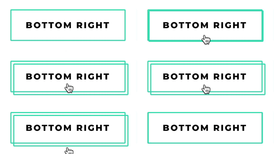
Use the CSS class dl-double-border-bottom-right. Set the same border width in the CSS code as the border width in the Button module settings.
/* CSS for buttons - Double border on hover - Bottom & Right */
.dl-double-border-bottom-right {
  --border-width: 2px; /* set the Button border width */
}

#page-container .et-l .et_pb_section .et_pb_button.dl-double-border-bottom-right::after {
  content: '' !important;
  display: block !important;
  inset: calc(var(--border-width) * -1);
  margin: 0 !important;
  transform: none;
  opacity: 1;
  border: inherit;
  border-radius: inherit;
  background: none;
  z-index: -1;
  transition: translate .3s ease, inset .3s ease;
}

#page-container .et-l .et_pb_section .et_pb_button.dl-double-border-bottom-right:hover::after {
  translate: calc(var(--border-width) * 2.5) calc(var(--border-width) * 2.5);
}
Bottom & left
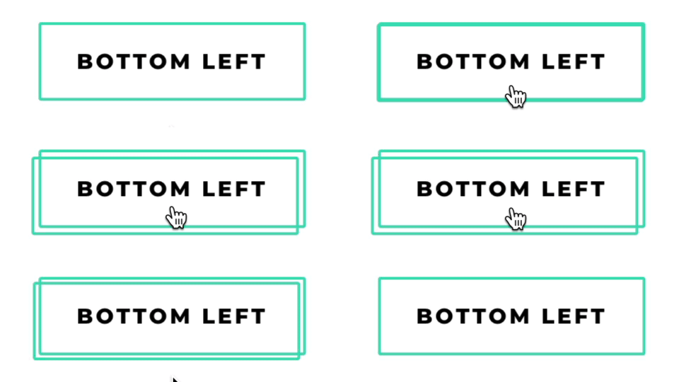
Use the CSS class dl-double-border-bottom-left. Set the same border width in the CSS code as the border width in the Button module settings.
/* CSS for buttons - Double border on hover - Bottom & Left */
.dl-double-border-bottom-left {
  --border-width: 2px; /* set the Button border width */
}

#page-container .et-l .et_pb_section .et_pb_button.dl-double-border-bottom-left::after {
  content: '' !important;
  display: block !important;
  inset: calc(var(--border-width) * -1);
  margin: 0 !important;
  transform: none;
  opacity: 1;
  border: inherit;
  border-radius: inherit;
  background: none;
  z-index: -1;
  transition: translate .3s ease, inset .3s ease;
}

#page-container .et-l .et_pb_section .et_pb_button.dl-double-border-bottom-left:hover::after {
  translate: calc(var(--border-width) * -2.5) calc(var(--border-width) * 2.5);
}
Center
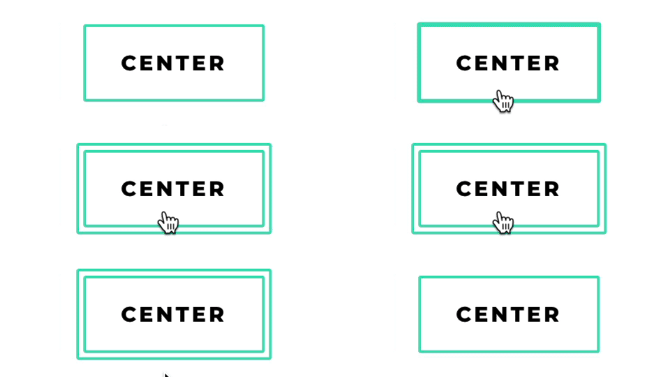
Use the CSS class dl-double-border-center. Set the same border width in the CSS code as the border width in the Button module settings.
/* CSS for buttons - Double border on hover - Center */
.dl-double-border-center {
  --border-width: 2px; /* set the Button border width */
}

#page-container .et-l .et_pb_section .et_pb_button.dl-double-border-center::after {
  content: '' !important;
  display: block !important;
  inset: calc(var(--border-width) * -1);
  margin: 0 !important;
  transform: none;
  opacity: 1;
  border: inherit;
  border-radius: inherit;
  background: none;
  z-index: -1;
  transition: translate .3s ease, inset .3s ease;
}

#page-container .et-l .et_pb_section .et_pb_button.dl-double-border-center:hover::after {
  inset: calc(var(--border-width) * -3.5);
}
Fade out

Use the CSS class dl-double-border-fade-out. Set the same border width in the CSS code as the border width in the Button module settings.
/* CSS for buttons - Double border on hover - Fade Out */
.dl-double-border-fade-out {
  --border-width: 2px; /* set the Button border width */
}

#page-container .et-l .et_pb_section .et_pb_button.dl-double-border-fade-out::after {
  content: '' !important;
  display: block !important;
  inset: calc(var(--border-width) * -1);
  margin: 0 !important;
  transform: none;
  opacity: 1;
  border: inherit;
  border-radius: inherit;
  background: none;
  z-index: -1;
  transition: inset .5s ease-out, opacity .5s ease-out;
}

#page-container .et-l .et_pb_section .et_pb_button.dl-double-border-fade-out:hover::after {
  inset: calc(var(--border-width) * -6);
  opacity: 0;
}
4. Animated lines
Horizontal lines

Use the CSS class dl-lines-horizontal.
/* CSS for buttons - Animated Lines on hover - Horizontal */
.dl-lines-horizontal {
  --border-width: 2px; /* set line width */
  --border-color: #000; /* set line color */
}

#page-container .et-l .et_pb_section .et_pb_button.dl-lines-horizontal::before,
#page-container .et-l .et_pb_section .et_pb_button.dl-lines-horizontal::after {
  content: '' !important;
  display: block !important;
  margin: 0 !important;
  transform: none;
  opacity: 1;
  background: none;
  border: 0 solid var(--border-color);
  pointer-events: none;
  left: 0;
  right: 0;
  height: 0;
  scale: 0 1;
  transition: scale .3s ease;
}

#page-container .et-l .et_pb_section .et_pb_button.dl-lines-horizontal::before {
  top: calc(var(--border-width) * -1);
  bottom: auto;
  border-top-width: var(--border-width);
  transform-origin: left;
}

#page-container .et-l .et_pb_section .et_pb_button.dl-lines-horizontal::after {
  top: auto;
  bottom: calc(var(--border-width) * -1);
  border-bottom-width: var(--border-width);
  transform-origin: right;
}

#page-container .et-l .et_pb_section .et_pb_button.dl-lines-horizontal:hover::before,
#page-container .et-l .et_pb_section .et_pb_button.dl-lines-horizontal:hover::after {
  scale: 1 1;
}
Lines from the left
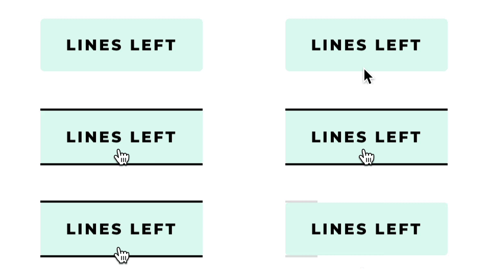
Use the CSS class dl-lines-left.
/* CSS for buttons - Animated Lines on hover - from the Left */
.dl-lines-left {
  --border-width: 2px; /* set line width */
  --border-color: #000; /* set line color */
}

#page-container .et-l .et_pb_section .et_pb_button.dl-lines-left::before {
  content: '' !important;
  display: block !important;
  margin: 0 !important;
  transform: none;
  opacity: 1;
  background: none;
  border: 0 solid var(--border-color);
  pointer-events: none;
  inset: calc(var(--border-width) * -1) 0;
  border-top-width: var(--border-width);
  border-bottom-width: var(--border-width);
  scale: 0 1;
  transform-origin: left;
  transition: scale .3s ease;
}

#page-container .et-l .et_pb_section .et_pb_button.dl-lines-left:hover::before {
  scale: 1 1;
}
Lines from the right
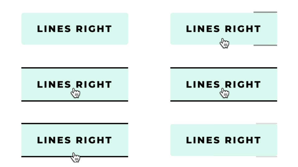
Use the CSS class dl-lines-right.
/* CSS for buttons - Animated Lines on hover - from the Right */
.dl-lines-right {
  --border-width: 2px; /* set line width */
  --border-color: #000; /* set line color */
}

#page-container .et-l .et_pb_section .et_pb_button.dl-lines-right::before {
  content: '' !important;
  display: block !important;
  margin: 0 !important;
  transform: none;
  opacity: 1;
  background: none;
  border: 0 solid var(--border-color);
  pointer-events: none;
  inset: calc(var(--border-width) * -1) 0;
  border-top-width: var(--border-width);
  border-bottom-width: var(--border-width);
  scale: 0 1;
  transform-origin: right;
  transition: scale .3s ease;
}

#page-container .et-l .et_pb_section .et_pb_button.dl-lines-right:hover::before {
  scale: 1 1;
}
Lines from the center

Use the CSS class dl-lines-center.
/* CSS for buttons - Animated Lines on hover - from the Center */
.dl-lines-center {
  --border-width: 2px; /* set line width */
  --border-color: #000; /* set line color */
}

#page-container .et-l .et_pb_section .et_pb_button.dl-lines-center::before {
  content: '' !important;
  display: block !important;
  margin: 0 !important;
  transform: none;
  opacity: 1;
  background: none;
  border: 0 solid var(--border-color);
  pointer-events: none;
  inset: calc(var(--border-width) * -1) 0;
  border-top-width: var(--border-width);
  border-bottom-width: var(--border-width);
  scale: 0 1;
  transform-origin: center;
  transition: scale .3s ease;
}

#page-container .et-l .et_pb_section .et_pb_button.dl-lines-center:hover::before {
  scale: 1 1;
}
Corners

Use the CSS class dl-lines-corners.
/* CSS for buttons - Animated Lines on hover - Corners */
.dl-lines-corners {
  --border-width: 2px; /* set line width */
  --border-color: #000; /* set line color */
}

#page-container .et-l .et_pb_section .et_pb_button.dl-lines-corners::before,
#page-container .et-l .et_pb_section .et_pb_button.dl-lines-corners::after {
  content: '' !important;
  display: block !important;
  margin: 0 !important;
  transform: none;
  opacity: 1;
  background: none;
  border: 0 solid var(--border-color);
  pointer-events: none;
  width: 0;
  height: 0;
  border-color: transparent;
  border-radius: inherit;
  transition: width .3s ease, height .3s ease, border-color 0s .3s;
}

#page-container .et-l .et_pb_section .et_pb_button.dl-lines-corners::before {
  inset: calc(var(--border-width) * -1) auto auto calc(var(--border-width) * -1);
  border-top-width: var(--border-width);
  border-left-width: var(--border-width);
}

#page-container .et-l .et_pb_section .et_pb_button.dl-lines-corners::after {
  inset: auto calc(var(--border-width) * -1) calc(var(--border-width) * -1) auto;
  border-bottom-width: var(--border-width);
  border-right-width: var(--border-width);
}

#page-container .et-l .et_pb_section .et_pb_button.dl-lines-corners:hover::before,
#page-container .et-l .et_pb_section .et_pb_button.dl-lines-corners:hover::after {
  width: calc(100% + var(--border-width) * 2);
  height: calc(100% + var(--border-width) * 2);
  border-color: var(--border-color);
  transition: width .3s ease, height .3s ease, border-color 0s;
}
5. Attention grabbers
Pulse

Use the CSS class dl-pulse. The CSS code works with any Divi element, not just a Button module.
/* CSS for buttons - Attention Grabber - Pulse */
#page-container .et-l .et_pb_section .dl-pulse {
  animation: dl-button-pulse 1.5s infinite;
}

@keyframes dl-button-pulse {
  0%, 30%, 60%, 100% { scale: 1; }
  15%, 45% { scale: 1.15; }
}

#page-container .et-l .et_pb_section .dl-pulse:hover {
  animation: none;
}

@media (prefers-reduced-motion: reduce) {
  #page-container .et-l .et_pb_section .dl-pulse {
    animation: none;
  }
}
Shadow pulse

Use the CSS class dl-shadow-pulse. The CSS code works with any Divi element, not just a Button module.
/* CSS for buttons - Attention Grabber - Shadow Pulse */
.dl-shadow-pulse {
  --shadow-color: #3fdfba; /* set shadow color */
}

#page-container .et-l .et_pb_section .dl-shadow-pulse {
  animation: dl-button-shadow-pulse 1s infinite;
}

@keyframes dl-button-shadow-pulse {
  0% { box-shadow: 0 0 0 0 var(--shadow-color); }
  50% { box-shadow: 0 0 0 1em transparent; }
  100% { box-shadow: 0 0 0 0 transparent; }
}

#page-container .et-l .et_pb_section .dl-shadow-pulse:hover {
  animation: none;
}

@media (prefers-reduced-motion: reduce) {
  #page-container .et-l .et_pb_section .dl-shadow-pulse {
    animation: none;
  }
}
Shake

Use the CSS class dl-shake. The CSS code works with any Divi element, not just a Button module.
/* CSS for buttons - Attention Grabber - Shake */
#page-container .et-l .et_pb_section .dl-shake {
  animation: dl-button-shake 1.5s infinite;
}

@keyframes dl-button-shake {
  10%, 90% { translate: -1px 0; }
  20%, 80% { translate: 2px 0; }
  30%, 50%, 70% { translate: -3px 0; }
  40%, 60% { translate: 3px 0; }
}

#page-container .et-l .et_pb_section .dl-shake:hover {
  animation: none;
}

@media (prefers-reduced-motion: reduce) {
  #page-container .et-l .et_pb_section .dl-shake {
    animation: none;
  }
}
Border pulse

Use the CSS class dl-border-pulse. The CSS code works with any Divi element, not just a Button module.
/* CSS for buttons - Attention Grabber - Border Pulse */
.dl-border-pulse {
  --border-width: 2px; /* set the border width */
  --border-color: #3fdfba; /* set the border color */
}

#page-container .et-l .et_pb_section .dl-border-pulse {
  position: relative; /* Buttons already have it; needed on other elements */
}

#page-container .et-l .et_pb_section .dl-border-pulse::after {
  content: '' !important;
  display: block !important;
  position: absolute;
  inset: 0;
  margin: 0 !important;
  transform: none;
  opacity: 1;
  border: var(--border-width) solid var(--border-color);
  border-radius: inherit;
  background: none;
  z-index: -1;
  animation: dl-button-border-pulse 1.2s infinite;
  transition: opacity .5s ease-out;
}

@keyframes dl-button-border-pulse {
  0%, 100% { inset: 0; }
  50% { inset: calc(var(--border-width) * -4); }
}

#page-container .et-l .et_pb_section .dl-border-pulse:hover::after {
  opacity: 0;
}

@media (prefers-reduced-motion: reduce) {
  #page-container .et-l .et_pb_section .dl-border-pulse::after {
    animation: none;
  }
}
These loops pause for visitors who turned off animations in their system settings.
Which one is your favorite?
I hope you found this tutorial helpful and easy to use. Let me know which style is your favorite! If you have any questions, you can ask them in my Divi Lovers Facebook group. It's a fantastic community of Divi users and web designers where we share useful tips and tricks.
And if you'd like to understand how CSS works with Divi, check out The Beginner Guide to Working with Custom CSS in Divi.