Good to know: the example screenshots were taken in 2022. All the example websites were still online in November 2026, but some of them may look different today.
New year, new projects, new trends! Like any other form of art, web design keeps evolving, sometimes moving in unexpected and thrilling directions, sometimes digging up old ideas and giving them a breath of new life. If you need inspiration for trying something interesting this year, we’ve compiled a list of some fabulous web design trends we’ve seen crop up recently.
Minimalism
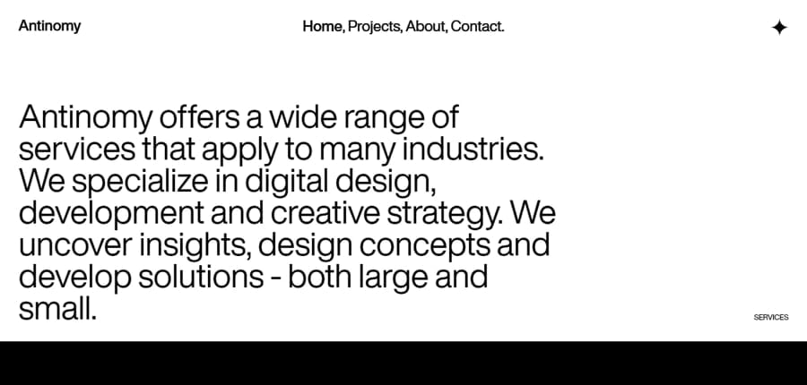
Minimalist web design means clean, uncluttered pages with plenty of white space, a very simple color scheme and a focus on just one type of element.
Of course, this is nothing new: minimalism has been a leading style in web design for quite some time, and it is here to stay. Clean, uncluttered, simple websites with plentiful white space and very simple (even black-and-white) color schemes convey professionalism and are easy to read and navigate. But there are various ways in which this trend is carried out. The effect of simplicity and space can be achieved by putting a focus on just one type of element: an image with minimal text, or just text in a simple sans-serif font, standing on its own.
Bold type
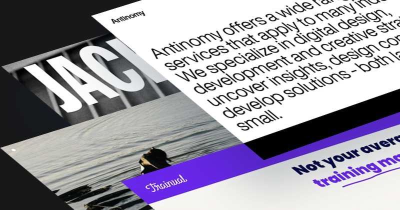
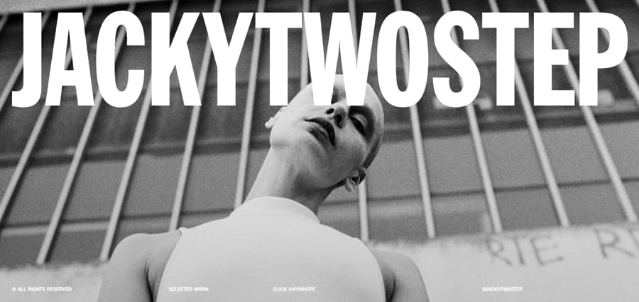
The bold type trend puts big, simple text front and center, often in all caps and a sans-serif font, so the words themselves become the main design element.
We’ve been seeing more and more excellent designs where simple text is front and center, and often larger than life. Written in all caps, in a simple sans-serif font, the bold, angular text dominates the design. A brand name presented like this creates a strong, bold statement. It is also an extension of the minimalism trend, because when you create such a strong accent, you can’t break this effect by adding too many attention-grabbing elements.
Immersion
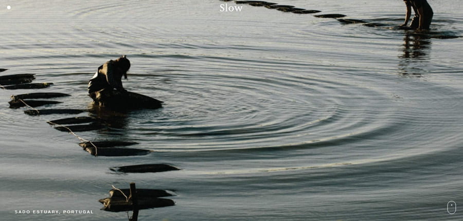
Immersive web design fills the whole screen with an evocative photo, video or animation, so the visitor feels an emotion before reading a single word.
We spend more and more of our lives online, so it is no surprise that we rely on the Web to provide us with experiences and emotions. Websites that offer this immersive experience are especially engaging. One way to achieve this immersion-type design is to create a cinematography-style website, where the full screen is filled with an evocative, beautiful photograph, video, or animation. The image engages the senses instantly and creates an emotion. This trend should be especially useful for any website which sells products or experiences.
Paper on page
The paper on page trend borrows the look of physical paper, like newspapers, workbooks or bullet journals, and brings it to the screen.
This is another example of the real world moving into Web spaces. In this trend, we see designers draw inspiration from physical paper mediums, such as newspapers or bullet journals. Bullet journal aesthetic is a growing trend of its own, so it’s not surprising designers incorporate the elements of this aesthetic into their designs.

Retro
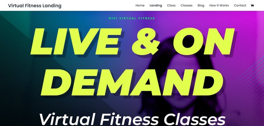
Retro web design brings back the look of past decades, and today that includes the bold colors of the 80s and 90s, and even the 2000s.
Retro used to mean really old styles, like Art Nouveau, the Roaring Twenties, or even the 50s and the Pin-up style. Well, now the term “retro” can be also applied to the 90s, and even the 2000s! Feel old yet? So, when we now see the bold colors of the 90s fashion in web design, it is an example of a retro style.
The trends combined
These trends work well together: many of the examples above already mix two or three of them, with very striking results.
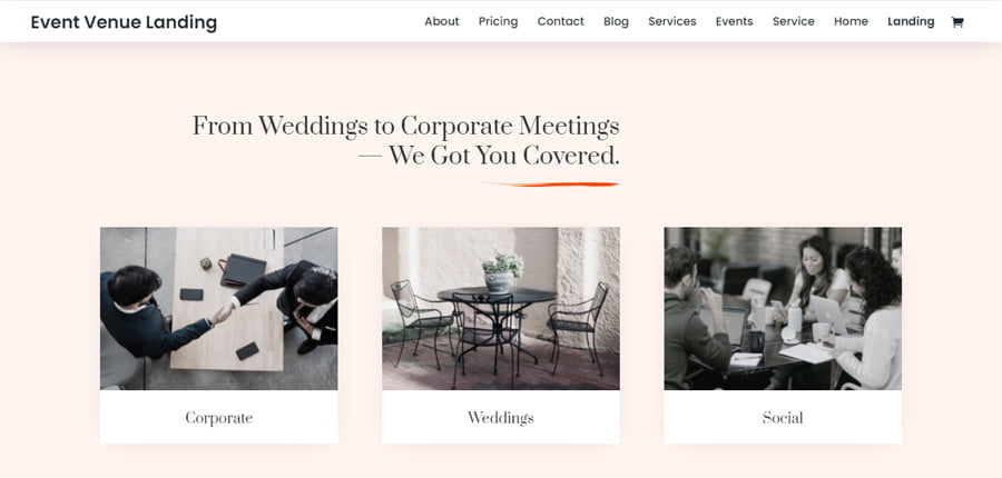
Here is an interesting layout that connects many of these elements. It’s minimalist, with muted colors and one accent color. The sepia images combined with the elegant Prata serif font create a nostalgic, retro effect, and the orange accents mimic handwritten notes.
Final thoughts
Minimalism, bold type, immersion, paper on page and retro styles each make a website stand out, and combining them is where the most striking designs happen.
It is always inspiring to take a look at new design ideas being shared on aggregator sites. Some are incredibly simple and easy to execute, and at the same time, powerful and influential. And some might definitely require more advanced skills, so if you’re looking for a way to level up your game and learn custom CSS, we have a comprehensive free guide that will teach you all you need to know.
If you’d like to try the bold type trend in Divi 5, fluid font sizes make huge headings scale nicely from phone to desktop: our CSS clamp calculators help you set them up. And a Divi design system keeps a minimalist palette and your fonts consistent across the whole website.
We hope this post gave you some inspiration today! What is your favorite new (or new-old) web design trend? Share it in my Divi Lovers Facebook group!