Updated for Divi 5: In Divi 5, the Blog module has its own Grid layout with a Number of Columns setting, so you can choose how many posts sit in a row without any CSS. Divi 5 also wraps the posts in a new .et_pb_blog_posts container, so the CSS below is updated for Divi 5, and the original Divi 4 version is still included.
How to change the number of posts in a row in the Divi Blog module
In Divi 5, open the Blog module and go to Design tab ➜ Layout: set Layout Style to Grid and type any Number of Columns, separately for desktop, tablet and phone. In Divi 4, the Grid layout picks the number of columns automatically (three at most), so for anything else you need CSS Grid.
Divi Theme Blog Module comes with two different layout options: the Fullwidth layout and the Grid. In Divi 4, we do not have a lot of control over the look of the grid elements. The number of posts in a row is controlled automatically, depends on the current screen size, and is limited to three columns at most.
In this tutorial, I'd like to show you how to use the powerful CSS Grid to customize the grid layout to any number of columns and even break the grid by changing the size of some of the posts.
Free blog layouts for the Divi Theme Builder
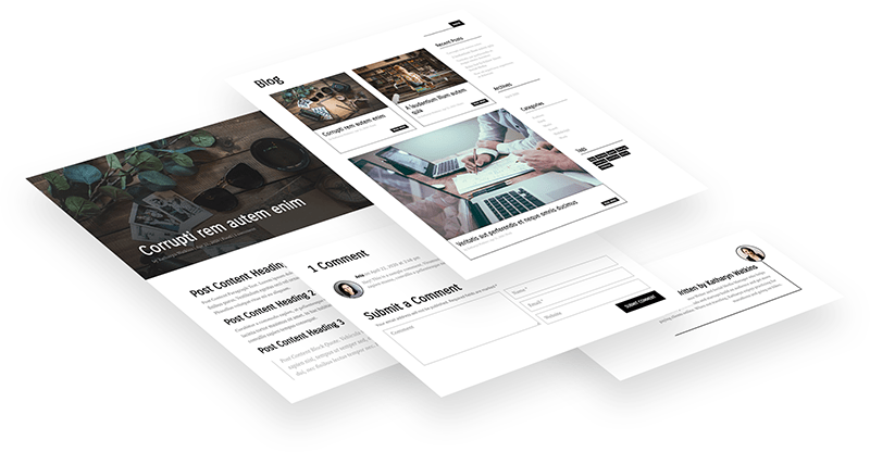
I made two free Divi Theme Builder templates for your blog: an archive/category page and a single post template, both styled with the CSS Grid from this tutorial.
Divi Lover subscribers can download and use these free Divi Blog Theme Builder templates, which include a template for the archives/categories and a single post template! Check out the demo pages and let me know what you think in my Divi Lovers Facebook group!
Free download
Blog Theme Builder Layout Pack
Two Divi Theme Builder templates for your blog, an archive/category page with a CSS Grid post layout and a single post template with comments and related posts. Works in Divi 5 and Divi 4.
Get the free downloadThe video was recorded in Divi 4. The idea is the same in Divi 5, but the Divi 5 Blog module needs the updated CSS selector (.et_pb_blog_posts) from this post, and the class is added in a different place (see Step 2).
How to set the number of columns in Divi 5 (no CSS)
Divi 5 builds the Blog module grid with real CSS Grid, so the number of columns and the gaps are regular settings in the Design tab. You only need CSS if you want to "break" the grid and make some posts wider.
- Open your Blog module settings and go to Design tab ➜ Layout.
- Set Layout Style to Grid (it is the default for a new Blog module).
- Set Number of Columns, for example 4. Switch to the tablet and phone views to set a different number for smaller screens, for example 2 and 1.
- Use Horizontal Gap and Vertical Gap to change the space between the posts.
To make one of the posts wider, add a CSS class to the Blog module (Step 2 below) and use the span rule from "Targeting the nth-posts". Reset it on phones, where the grid has only one column:
.dl-blog-module1 .et_pb_blog_posts .et_pb_post:nth-child(5) {
    grid-column: span 2;
}

@media (max-width: 767px) {
    .dl-blog-module1 .et_pb_blog_posts .et_pb_post:nth-child(n) {
        grid-column: auto;
    }
}
How to use CSS Grid with the Divi Blog module
Set the Blog module to a single-column layout, give it a CSS class, and turn its posts container into a CSS grid. In Divi 5, the posts container is .et_pb_blog_posts; in Divi 4, it is .et_pb_ajax_pagination_container.
Step 1: Change the Blog layout
To use the CSS Grid we need to make sure our Blog module has a correct HTML structure. In Divi 5, go to Design tab ➜ Layout and set Layout Style to Block, so Divi doesn't add its own grid styles. In Divi 4, navigate to the Module Design settings and change the layout to Fullwidth.
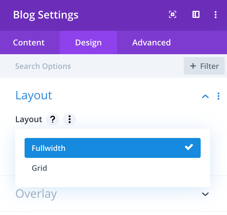
This will make sure that each post, the article tag, is displayed inside the same parent container, which we can target with CSS.
Step 2: Add a CSS class to the Blog module
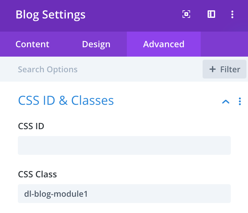
Next, add a custom CSS class to your Blog module (I forgot about this myself when I recorded this walkthrough, but it is an important step). In Divi 5, go to Advanced tab ➜ Attributes ➜ Add Attribute ➜ CSS Class; in Divi 4, go to Advanced tab ➜ CSS ID & Classes. I am going to use the dl-blog-module1 CSS class:
Step 3: Add the custom CSS
Add the CSS in Divi ➜ Theme Options ➜ General ➜ Custom CSS, or only for one page in Page Settings ➜ Advanced ➜ Custom CSS (in Divi 5, Page Settings are in the gear menu at the top left of the builder). First, we need to target the parent container of the posts, the div with the et_pb_blog_posts CSS class:
.dl-blog-module1 .et_pb_blog_posts {
    display: grid;
    grid-gap: 20px;
    grid-template-columns: repeat(4, 1fr);
}

.dl-blog-module1 .et_pb_blog_posts .et_pb_post {
    margin-bottom: 0;
}
This will create a grid with 4 columns. The second rule removes the bottom margin of the posts, so the space between the rows is the same 20px as the space between the columns.
In Divi 5, the pagination ("Older Entries" / "Next Entries") sits outside the posts container, so it stays full-width below the grid without any extra CSS.
Changing the grid for mobile
Here are some CSS media queries, which you could use to change the number of posts in a row on smaller screen sizes:
@media (max-width: 980px) {
    .dl-blog-module1 .et_pb_blog_posts {
        grid-template-columns: repeat(3, 1fr);
    }
}

@media (max-width: 600px) {
    .dl-blog-module1 .et_pb_blog_posts {
        grid-template-columns: repeat(2, 1fr);
    }
}

@media (max-width: 460px) {
    .dl-blog-module1 .et_pb_blog_posts {
        grid-template-columns: repeat(1, 1fr);
    }
}
Targeting the nth-posts
You can "stretch" any post using the span keyword and the grid-column property. You can use the post ID to target one specific post (for example .post-123) or the nth-child selector to target the fifth one, or every third, etc. You'll find a handy guide with some nth-child examples on the CSS-Tricks website.
This is how your CSS could look:
.dl-blog-module1 .et_pb_blog_posts .et_pb_post:nth-child(5) {
    grid-column: span 2;
}
On a one-column grid, a post that spans two columns adds an extra column and breaks the layout, so reset it in the smallest media query:
@media (max-width: 460px) {
    .dl-blog-module1 .et_pb_blog_posts .et_pb_post:nth-child(n) {
        grid-column: span 1;
    }
}
The Divi 4 version of the CSS
In Divi 4 (and in Divi 4 layouts that haven't been converted to Divi 5 yet), the posts sit directly in the .et_pb_ajax_pagination_container div, together with the pagination. This is the original CSS from the video:
.dl-blog-module1 .et_pb_ajax_pagination_container {
    display: grid;
    grid-gap: 20px;
    grid-template-columns: repeat(4, 1fr);
}
The CSS code below will stretch the container with pagination to full-width:
.dl-blog-module1 .et_pb_ajax_pagination_container>div {
    grid-column: span 4;
}
We could also use grid-column-start: 1; grid-column-end: 5; or the shorter version, grid-column: 1 / 5;. For smaller screens, change both numbers in each media query:
@media (max-width:980px) {
	.dl-blog-module1 .et_pb_ajax_pagination_container {
		grid-template-columns: repeat(3, 1fr);
	}
	.dl-blog-module1 .et_pb_ajax_pagination_container>div {
		grid-column: span 3;
	}
}

@media (max-width:600px) {
	.dl-blog-module1 .et_pb_ajax_pagination_container {
		grid-template-columns: repeat(2, 1fr);
	}
	.dl-blog-module1 .et_pb_ajax_pagination_container>div {
		grid-column: span 2;
	}
}

@media (max-width:460px) {
	.dl-blog-module1 .et_pb_ajax_pagination_container {
		grid-template-columns: repeat(1, 1fr);
	}
	.dl-blog-module1 .et_pb_ajax_pagination_container>div {
		grid-column: span 1;
	}
}
To stretch a post in Divi 4, use .dl-blog-module1 .et_pb_ajax_pagination_container .et_pb_post:nth-child(5) { grid-column: span 2; }. Once the layout is converted to Divi 5 (by the Divi 5 Migrator, or when you edit and save it in the Divi 5 builder), switch to the .et_pb_blog_posts CSS above: with the old selectors, the posts stack in one full-width column.
Divi 5 alternative: build a custom blog grid with the Loop Builder
If you want full control over the post card design, Divi 5 has a Loop Builder: any module, group or column can repeat itself for each post (Advanced tab ➜ Loop). Design one card with a Group and Image, Heading and Text modules that show the post's dynamic content, turn on the loop, and set the parent's Design tab ➜ Layout to Grid with the number of columns you want.
The Blog module is still there in Divi 5 and is the quickest option. The Loop Builder is the way to go when the Blog module's card layout isn't flexible enough for your design.
Free Theme Builder Blog Layout Pack
The free pack contains two Theme Builder templates in one JSON file: "All Archive Pages" (category/archive layout with the CSS Grid blog and a sidebar) and "All Posts" (single post layout with comments and related posts).
I've played with custom CSS and the grid a bit and created this Category/Archive page layout along with the Single Post layout. Feel free to download the JSON file if you're a Divi Lover subscriber! I hope it's useful!
If you build something with it, share it in my Divi Lovers Facebook group!