Updated for Divi 5: The CSS still works in Divi 5, because the Menu module keeps its Divi 4 class names and still switches to the hamburger menu at 980px and below. I tested it on Divi 5.18, made the selectors a bit more specific, added one line that keeps the links left-aligned on tablets and phones, and added a Divi 5 version you can paste straight into the module's Free-Form CSS, no class needed.
How to create a vertical menu in the Divi footer with the Menu module
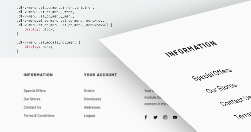
Give the Menu module a CSS class, then add a few lines of CSS that set its wrappers to display: block and hide the hamburger icon. The links stack into a simple vertical list, and they stay that way on tablets and phones too.
Divi's Menu Module, by default, uses the horizontal layout, and was designed for the Header as the horizontal navigation. But there are certain situations (when creating a Footer or a Sidebar layout, for example) when we'd like to display all the menu items vertically, as a simple list of links, without the hamburger mobile menu version.
Yes, we can use the Text module and add our list of links manually, but using the WordPress Menus when selecting links is more user-friendly and opens up additional possibilities.
In this short walkthrough, I'll show you how to use a few lines of CSS to change the default Menu module appearance and how to add a fun hover effect to your menu links!
The video was recorded in Divi 4. In Divi 5 the steps and the CSS are the same, only the CSS class field moved: Advanced → Attributes → Add Attribute → CSS Class.
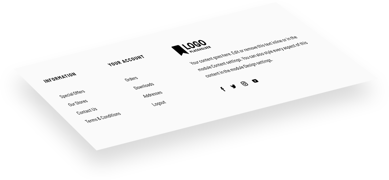
This sample footer layout is available to download for free. You can also see it in action on the live preview page.
Free download
Footer with Vertical Menus Layout
A Divi footer layout with two vertical Menu modules on every screen size, plus the CSS in a Code module. Works in Divi 5 and Divi 4.
Get the free downloadHow to change the Menu alignment with CSS
At 980px and below, Divi hides the Menu module's links and shows the hamburger icon instead (in Divi 4 and in Divi 5). The CSS below overrides both: it sets the menu wrappers to display: block, so the links stack vertically on every screen width, and it hides .et_mobile_nav_menu, the hamburger version.
To target a specific module, and not all Menus on the entire website, add a custom CSS class to the Menu module: dl-v-menu. In Divi 5, open the Menu settings → Advanced → Attributes → Add Attribute → CSS Class (in Divi 4: Advanced → CSS ID & Classes → CSS Class). This bit of CSS changes the alignment of that menu and hides the default mobile menu version with the hamburger icon:
.dl-v-menu.et_pb_menu .et_pb_menu_inner_container,
.dl-v-menu.et_pb_menu .et_pb_menu__wrap,
.dl-v-menu.et_pb_menu .et_pb_menu__menu,
.dl-v-menu.et_pb_menu .et_pb_menu__menu>nav,
.dl-v-menu.et_pb_menu .et_pb_menu__menu>nav>ul {
    display: block;
}

.dl-v-menu.et_pb_menu .et_mobile_nav_menu {
    display: none;
}

.dl-v-menu.et_pb_menu .et_pb_menu__menu>nav>ul {
    text-align: left;
}
Paste it in Divi → Theme Options → General → Custom CSS to use it site-wide, or in a Code module wrapped in <style> tags (that's how the free footer layout does it). The class makes sure only the menus you choose turn vertical, so your header menu keeps its normal mobile version.
Why .dl-v-menu.et_pb_menu and not just .dl-v-menu? Divi's own rules that hide the links on smaller screens have the same strength as the shorter selector, so with the short version the result depends on which CSS loads last. The longer selector wins wherever you paste it.
The last rule keeps the links left-aligned. The Divi 5 Menu module aligns its text to the right on tablets and phones by default, which shows on longer links that wrap to two lines (and on any link that gets wider than its text). Want a centered menu instead? Change left to center.
Divi 5 option: paste the CSS into the Menu module itself
In Divi 5 you can skip the class completely. Open the Menu module settings → Advanced → CSS → Free-Form CSS and paste the code below. Divi replaces the word selector with that module's own class, so the CSS only affects this one menu (the hover effect from the next section is included):
selector .et_pb_menu_inner_container,
selector .et_pb_menu__wrap,
selector .et_pb_menu__menu,
selector .et_pb_menu__menu>nav,
selector .et_pb_menu__menu>nav>ul {
    display: block;
}

selector .et_mobile_nav_menu {
    display: none;
}

selector .et_pb_menu__menu>nav>ul {
    text-align: left;
}

selector a:before {
    content: '';
    background: gray;
    display: block;
    position: absolute;
    width: 10px;
    height: 2px;
    top: .6em;
    left: -20px;
    opacity: 0;
    transition: all .3s ease-in-out;
}

selector a:hover:before {
    left: -10px;
    opacity: 1;
}

selector a:hover {
    padding-left: 5px;
}
How to add a hover effect to the menu items
The effect uses the link's :before pseudo-element to draw a short line that slides in from the left on hover, while the link itself moves a few pixels to the right. It works the same way in Divi 4 and Divi 5.
Here's an example of a fun hover effect, which adds a gray animated line next to the menu item and slightly moves the link to the right:
.dl-v-menu a:before {
    content: '';
    background: gray;
    display: block;
    position: absolute;
    width: 10px;
    height: 2px;
    top: .6em;
    left: -20px;
    opacity: 0;
    transition: all .3s ease-in-out;
}

.dl-v-menu a:hover:before {
    left: -10px;
    opacity: 1;
}

.dl-v-menu a:hover {
    padding-left: 5px;
}
Change background: gray to your brand color to match your design.
What about vertical menus with sub-menus?
This CSS only changes the alignment of the top-level links: sub-menus still open as Divi's regular hover dropdowns, which can cover the links below them. It works best for short, one-level menus, like the footer menus in the free layout.
If your vertical menu has sub-menus, collapsible sub-menus are a better fit. I explain how to build them in Vertical Menu with Collapsible Submenus: Step-by-Step Divi Tutorial.
Final thoughts
Don't forget to check out the demo page to see the sample footer layout and vertical menu navigation with the hover effect in action!
For more ways to style the Menu module, see my Divi Menu module hover effects and the sub-menu dropdown styling guide.
I hope you'll find this helpful! If you have questions or want to show me your vertical menu, share it in my Divi Lovers Facebook group.