Updated for Divi 5: this effect works in Divi 5 without changes, because the Divi 5 Menu module still uses the same classes as Divi 4 (ul.et-menu, current-menu-item). The only thing that moved is where you add the CSS class: in Divi 5 it is Advanced → Attributes.
How to create an underline hover effect for the Divi Menu module
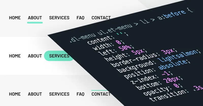
You create it with one CSS pseudo-element: add a CSS class to the Menu module, then style a :before on each first-level menu link as a thin line that grows from the center on hover and stays visible on the current page.
You can add fun animated hover effects to the Divi Menu with CSS. It's easier than you think and so fun to experiment with! In this tutorial, I'll walk you step-by-step through the process, showing you how to create this effect on your own, and how to customize it so it can suit the style of your website and look fantastic.
If you're a bit intimidated by the hands-on approach to CSS in this one, you can check out my previous tutorial that allows you to achieve 7 variations of this effect with easy copy-and-paste snippets. But I really hope you will join me in this fun adventure! If you think of yourself as a CSS beginner, though, and want to feel more confident, I encourage you to check out my free CSS in Divi guide.
Make sure you watch the video, and let's get started!
Free download
Divi Menu Hover Effects Layout
A Divi page with 7 Menu module hover effects (animated underlines and highlights) and all the CSS in one Code module. Works in Divi 5 and Divi 4.
Get the free downloadWant to see it in action first? Check out the live preview.
The hover effect looks fun and easy, and it is also really easy to achieve. We're going to use CSS pseudo-elements to add this effect and manipulate it using a few different CSS properties. First, we'll have to find the right CSS selector for the task, then decide what our links should look like, and finally, how to achieve that animated hover effect. Hopefully, this explanation will make it clear how to do this, and also, how you can manipulate this effect in any way you want.
The video was recorded in Divi 4. The CSS is exactly the same in Divi 5; only the place where you add the CSS class to the Menu module is different (see the next section).
Where to add the CSS class and the CSS code in Divi 5
Add the class dl-menu to the Menu module in Advanced → Attributes, and paste the CSS in Page Settings or Theme Options.
- CSS class: in Divi 5, open the Menu module settings → Advanced → Attributes → Add Attribute → CSS Class, and type
dl-menu. In Divi 4: Advanced → CSS ID & Classes → CSS Class. - CSS code for one page: in Divi 5, click the gear icon in the top-left corner of the builder → Page Settings → Advanced → Custom CSS.
- CSS code for the whole site (for example a menu in your Theme Builder header): Divi → Theme Options → General → Custom CSS.
If you use the class on a menu in a global header, the site-wide option is the one you want, so the effect shows on every page.
How to target Divi Menu links with the CSS :before pseudo-element
Use the selector .dl-menu ul.et-menu > li > a:before: it targets only the first-level links of the menu inside the module with your class, and skips the logo and sub-menu links.
CSS pseudo-elements work as if you had added a whole new HTML element into the markup, rather than applying styling to existing elements. We can use it to add any element next to our Menu links. Next, we can edit the appearance of the pseudo-element with any CSS properties!
Target all links in the Menu module
Here's the CSS selector I used to add the :before pseudo-element to all links inside the Menu module with the CSS class of dl-menu:
/* This targets all links within a container */

.dl-menu a:before {
    content:'Sample Text';
}
Target only the links in the menu list
The problem with this selector is that it is too generic: it would target the Logo link, too. Here's a more specific selector that specifies two parent containers: the dl-menu CSS class added to the Menu module and an unordered list with a CSS class of et-menu:
/* This targets all links within a menu list inside the container */

.dl-menu ul.et-menu a:before {
    content:'Sample Text';
}
Target only first-level links (no sub-menu items)
And to limit it further, we can make sure to only target first-level links and not sub-menu items:
/* This targets first-level links within a menu list inside the container */

.dl-menu ul.et-menu > li > a:before {
    content:'Sample Text';
}
These selectors work in Divi 4 and Divi 5: the Divi 5 Menu module outputs the same ul.et-menu list with li items and ul.sub-menu sub-menus.
How to style the underline and animate it on hover
Give the pseudo-element an empty content: '', a width, a height, a background color and position: absolute, then start it at width: 0 and expand it to width: 110% on hover, with a transition for the animation.
Draw the underline
Now, instead of "Sample text" we can specify the position and the appearance of the pseudo-element. The CSS code below shows the 5px underline below the Menu text:
.dl-menu ul.et-menu > li > a:before {
    content: '';
    width: 110%;
    left: -5%;
    height: 5px;
    border-radius: 3px;
    background: lightsalmon;
    position: absolute;
    z-index: -1;
    bottom: 20px;
}
You don't need to add position: relative to the link yourself: Divi already gives every menu link position: relative (in Divi 4 and Divi 5), so the underline is positioned relative to each link.
Separate the initial state and the hover state
Next, we need to decide on the appearance of the pseudo-element and separate the styling for the initial state and for the hover state:
/* The Initial State */
.dl-menu ul.et-menu > li > a:before {
    content: '';
    width: 0;
    left: 50%;
    height: 5px;
    border-radius: 3px;
    background: lightsalmon;
    position: absolute;
    z-index: -1;
    bottom: 20px;
    opacity: 0;
}

/* The Hover State */
.dl-menu ul.et-menu > li > a:hover:before {
    width: 110%;
    left: -5%;
    opacity: 1;
}
Add a smooth transition
To make sure the transition between the initial and the hover state is not abrupt, we have to add a transition property. We can use the Cubic Bezier generator to generate a custom timing function: transition: .3s cubic-bezier(.25,.01,.32,1.61);
How to show the underline on the current menu item
Add a second selector with the current-menu-item class to the hover rule: WordPress adds this class to the menu item that links to the page you are viewing, so the underline stays visible there.
If one of the menu links targets the currently viewed URL, it gets the additional CSS class of current-menu-item. We can use that class to add a second target that needs to look the same as the hover state. The final CSS code used in the example looks like this:
.dl-menu ul.et-menu > li > a:before {
    content: '';
    width: 0;
    left: 50%;
    height: 5px;
    border-radius: 3px;
    background: lightsalmon;
    position: absolute;
    z-index: -1;
    bottom: 20px;
    opacity: 0;
    transition: .3s cubic-bezier(.25,.01,.32,1.61);
}

.dl-menu ul.et-menu > li > a:hover:before,
.dl-menu ul.et-menu > li.current-menu-item > a:before  {
    width: 110%;
    left: -5%;
    opacity: 1;
}

.dl-menu ul.et-menu > li > a {
    z-index: 1;
}
The last rule keeps the line behind the link text: z-index: 1 on the link creates a new layer, so the z-index: -1 underline sits under the text but stays visible.
How to adjust the underline position (menu with or without a logo)
Change the bottom value: bottom: 20px fits a Menu module with a logo, while a Menu module without a logo needs about bottom: 0px, or the line ends up behind the text.
This is because Divi gives the menu links different bottom padding in each case (the same in Divi 4 and Divi 5):
- Menu with a logo: links get
padding: 31px 0(31px above and below the text), so a line 20px from the bottom of the link sits just under the text. - Menu without a logo: links get only
padding-bottom: 8px, so 20px from the bottom puts the line in the middle of the text, like a highlighter. Setbottom: 0pxto place it just under the text.
If you changed the menu link spacing yourself, adjust the bottom value until the line sits where you like it. A highlighter look (the line behind the lower half of the text) can be fun, too!
Enjoy your new fun hover effect!
Feel free to copy the code snippets, or write your own and play with the possibilities! There is a lot you can do to add your own spin to this simple hover effect: change the color, the height, the border radius or the timing function. I invite you to share your results in my Divi Lovers Facebook group, because I'm really curious what you came up with!
Want more variations without writing the CSS yourself? Grab the 7 copy-and-paste Divi Menu hover effects, or style your dropdowns with the sub-menu dropdown styling guide. Thank you for watching and reading!