Updated for Divi 5: I wrote this in March 2026, right after Divi 5 came out of beta. All five features are still at the heart of the current Divi 5 builder, and I've added links to the tutorials where I show them in practice.
Divi 5 is officially out of beta. It launched last week, and I have a lot of feelings about it.
I've spent the better part of the last year testing it, breaking things, and figuring out what actually works. So before we get into tutorials and deep dives (and there are plenty coming), I want to start here: with the stuff that genuinely excites me. The features that made me think: ok, this changes things.
If you haven't opened Divi 5 yet, this post is for you. Consider it a warm-up.
#1 Builder Speed & One-Click Editing
The Divi 5 builder is much faster than Divi 4, and you edit an element with a single click: its settings open right away, without hunting for the gear icon.
You feel this one within the first five minutes. Everything is faster: page loads, navigation, editing. You click on an element and you're already in it. No hunting for the gear icon, no extra clicks to open settings. It just works.
I know the interface change is jarring at first. I've seen the comments: it looks like Elementor, I preferred Divi 4. And I get it, my first impression wasn't love either. But this is one of those cases where "different" and "better" are the same thing. Once it clicks, there's no going back.
#2 Customizable Breakpoints & Responsive Editing
Divi 5 lets you switch on extra breakpoints (Phone Wide, Tablet Wide, Widescreen and Ultra Wide, next to Phone, Tablet and Desktop) and set their widths yourself. In a device view, every change you make applies only to that screen size.
Anyone who's spent time wrestling with mobile layouts in Divi 4 will appreciate this immediately.
You're no longer locked into three fixed breakpoints: you can add your own and define the exact screen widths. But the bigger win is the workflow: switch to a device preview and every change you make applies only to that screen size. No more toggling responsive icons control by control.
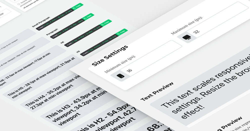
Add CSS clamp into the mix (a native responsive unit that automatically scales font sizes and spacing based on viewport width) and the amount of device-specific tweaking you need drops dramatically. This is one of those features that saves real time on every single project.
#3 Global Variables, Presets & Your Design System
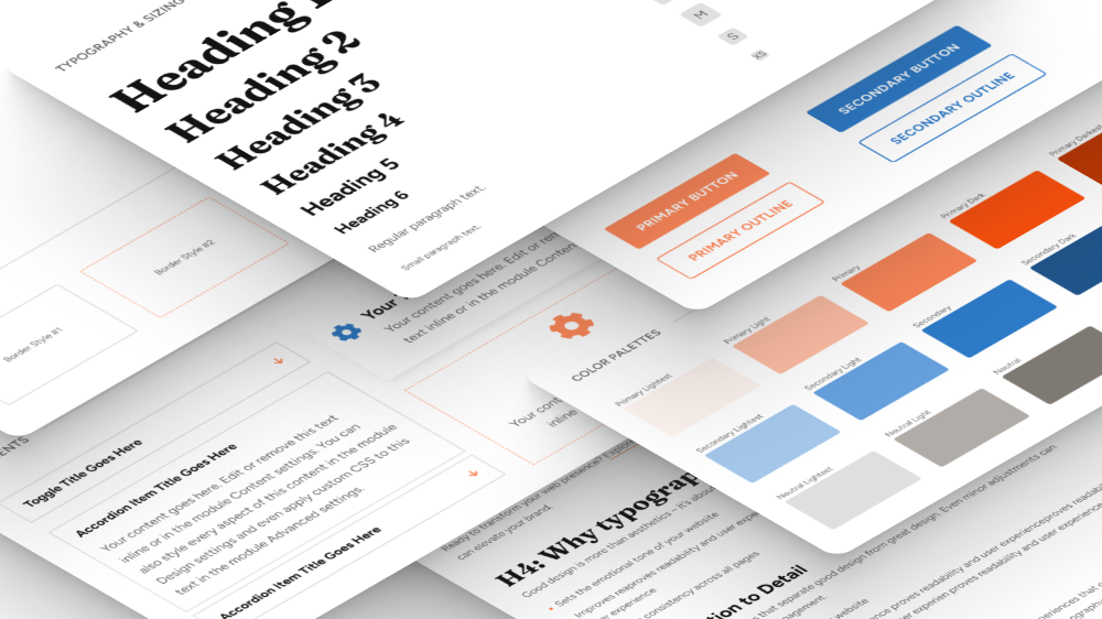
Divi 5 has a Variable Manager for your colors, fonts and sizes, and presets that save a whole styled element (or just one option group, like a border) so you can reuse it anywhere. Together they give you a design system inside Divi.
This is the one I talk about the most, because it changes how you build, not just what you build with.
Global Variables let you define your colors, fonts, and spacing in one place and pull them anywhere. Presets let you save styled elements (with borders, shadows, backgrounds, the whole set) and reuse them instantly. Combine the two with fluid CSS units and you have a working design system, built right inside Divi.
The feedback I've heard from students since launching my Design System mini-course has been genuinely moving. People saying they finally feel confident, that projects feel consistent, that they're faster without cutting corners. That's what a good system does: it removes the guesswork.
Want to see how I set one up? Read how I build a design system in Divi, and if you come from Divi 4, this guide shows how presets replaced the old Global Defaults.
#4 Module Groups, Flexbox & Grid
Divi 5 adds the Group module, nested rows, and Flexbox and CSS Grid layout settings (Design tab ➜ Layout) for sections, rows, columns and groups, so complex layouts no longer need custom CSS.
The power user section. Bear with me.
Module groups, nested rows, nested modules, customizable HTML tags, Flexbox, CSS Grid: all of it is now available inside the builder. What this means in practice: you have real, modern layout control without writing a single line of CSS.
In Divi 4, I could always push things to where I wanted them, but it took custom code. In Divi 5, the builder just... does it. The structural possibilities are genuinely unlimited, and the code it outputs is cleaner for it.
#5 Dynamic Content & the Loop Builder
In Divi 5 you can turn a section, row, column or group into a loop (Content tab ➜ Loop ➜ Loop Element) and fill the modules inside it with posts, custom post types, ACF fields and more, so you design your own post listings instead of using a fixed Blog module.
Dynamic content existed in Divi 4, but in Divi 5 it became a completely different thing.
The Loop Builder lets you design fully custom post listings from scratch (blog feeds, portfolios, testimonial grids, whatever you need) with pixel-level control over layout and content. Pair it with ACF and custom post types, and you can hand clients a website that looks exactly right and is genuinely easy for them to update themselves.
This is the feature that turns Divi into a proper site-building system, not just a page builder. I explain why it matters for client work in 3 reasons to integrate dynamic content into your Divi workflow.
Your turn: which Divi 5 feature are you most excited about?
Which of these features are you most excited to dig into? Or, if you're already using Divi 5, is there something that surprised you (good or bad)? Share it in my Divi Lovers Facebook group, I'd love to know where everyone's at.
Divi 5 content is going to be a big focus here going forward: tutorials, workflows, all of it. Subscribe on YouTube so you don't miss what's coming.
And if you want a structured starting point rather than jumping in blind:
- Divi 5 Design System Mini Course: the best first step if you want to build with intention from day one.
- Divi Stylist Academy: my in-depth Divi training for web designers.